
Challenge
The company was launching a major automotive e-commerce platform for parts ordering by professionals. Their goals were ambitious. They needed a landing page and visual identity that felt modern, efficient, and trustworthy. Internally, there was tension. Leadership saw efficiency and tech-first advantages, while the sales team viewed the shift to self-service with skepticism. The brand had to bridge that divide, earning trust across roles, while projecting innovation in a traditionally offline industry.
Approach
I started with stakeholder interviews and discovery sessions to understand the varied perspectives: what leadership wanted, what sales feared, and what users expected. From there I crafted a visual system that leaned into clarity and speed: a clean, vibrant color palette paired with a tech-inspired headline typeface and a readable body font (Lato). Because the logo was already approved, I focused on integrating it intentionally—making sure color, imagery, and structure reinforced it at every touchpoint. Meanwhile I worked closely with copy to make messaging simple and approachable, especially for users unfamiliar with digital tools.
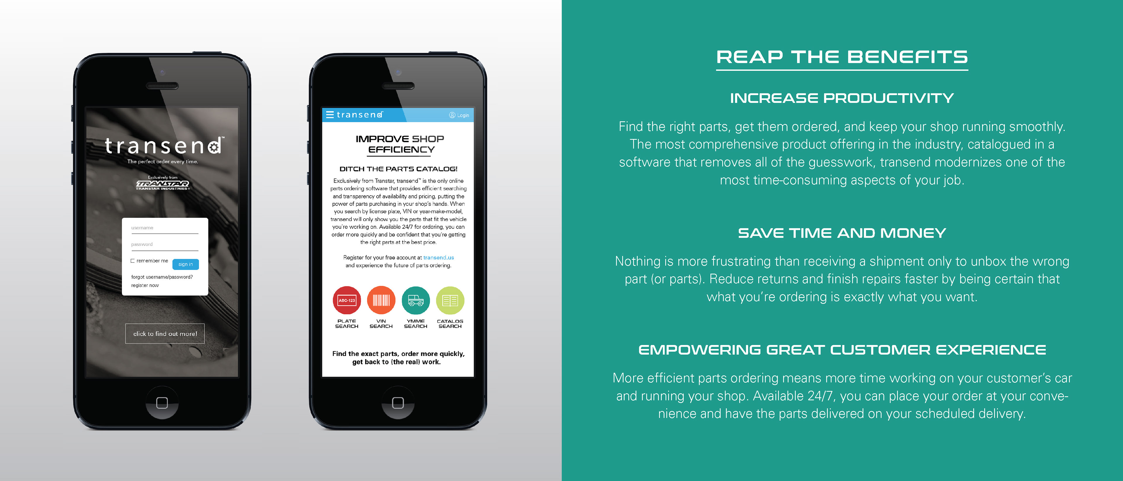
Brochure


Execution
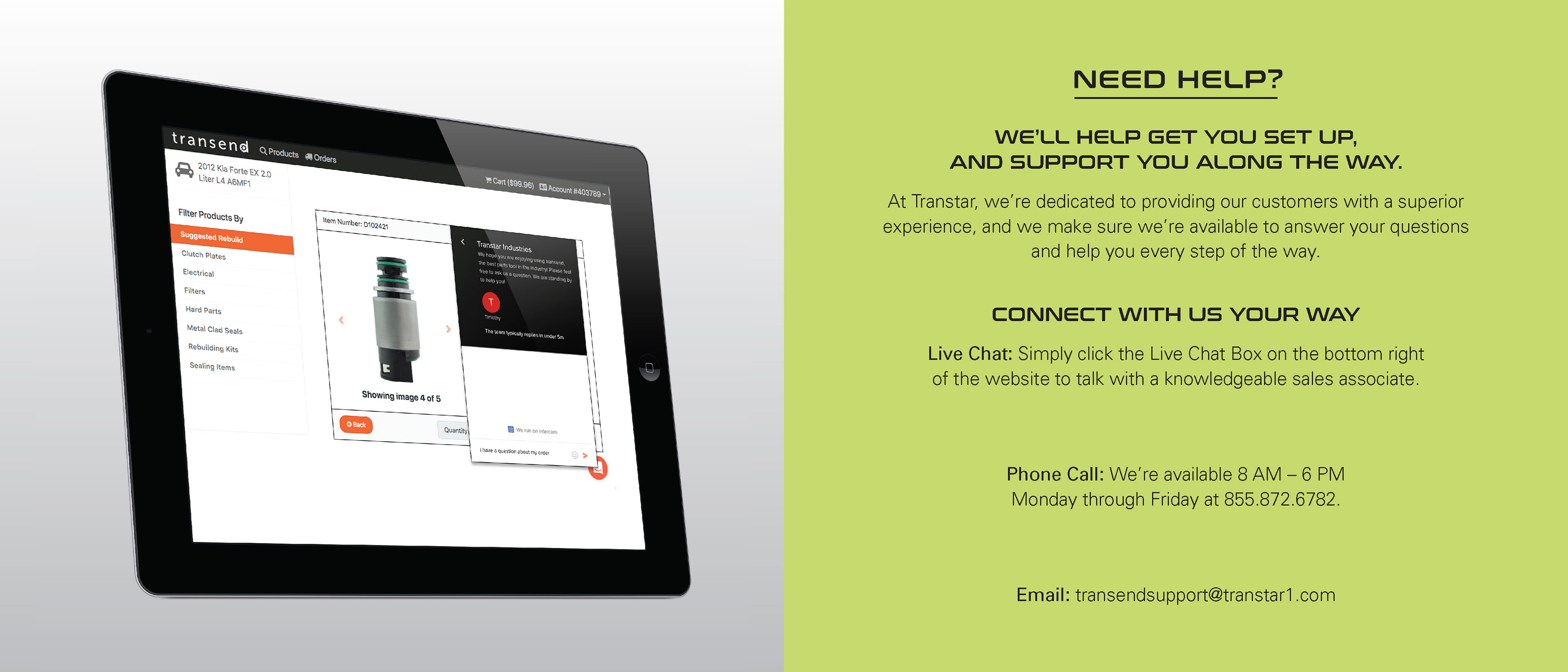
I designed a brochure to introduce the brand and highlight benefits, laying out features in digestible sections so the value props read well even at a glance. For the landing page, I created a long-scroll design that opened with a login section, moved into featured parts and product highlights, followed with a how-to guide, and clear calls to action. I used real product imagery and video alongside long scroll sections to keep users engaged. For email support, I started designs to guide users through signup and onboarding, ensuring every message felt cohesive with the visual identity and tone. Throughout, I negotiated design constraints with development and internal teams to ensure what looked good was also feasible.
Homepage Mockup
Outcomes
The landing page launched successfully alongside the platform and served as a strong front-end introduction while back-end development caught up. The brochure and initial brand assets helped align internal stakeholders around a shared vision. Even though email progress was slower and more debated, the visual system gave everything a unified feel, reducing confusion about identity across touchpoints. Users and internal teams responded well to how modern and approachable the platform felt, noting that the design reduced barriers trust often builds with familiarity and consistency.
Email Mockups
Next Steps & Insights
Working with limited resources and internal friction reinforced how essential early alignment and clear visual rules are. I learned that mockups help people see what “good” looks like before diving into implementation. In future similar projects I would push for prototyping across email and UI earlier, to test tone and flow. I’d also build more robust style documentation to smooth handoffs between design and dev. Finally I see opportunity to extend this system into motion and more dynamic interactions to strengthen the brand’s promise of speed and clarity.