
Challenge
When the company I was working with acquired a transmission manufacturer, they already had a logo in place but nothing else felt consistent. They needed a full brand system that could carry that identity across packaging, promotional pieces, and digital touchpoints. The goal was to make the torque converter line feel bold, technical, and unified while also standing out in a crowded industrial category.
Approach
I built out the brand system from the fundamentals. I chose a confident color palette, selected typography that worked for both display and technical applications, and defined graphic elements that felt engineered. I merged the parent company’s logo with the new identity in a lockup that honored both brands. From there I designed packaging, brochures, and web concepts so that every piece carried the same visual voice. I experimented with textures, patterns, product photography, and CAD renderings, always leaning toward technical precision and visual boldness.
Torque Converter Tri-fold Mailer

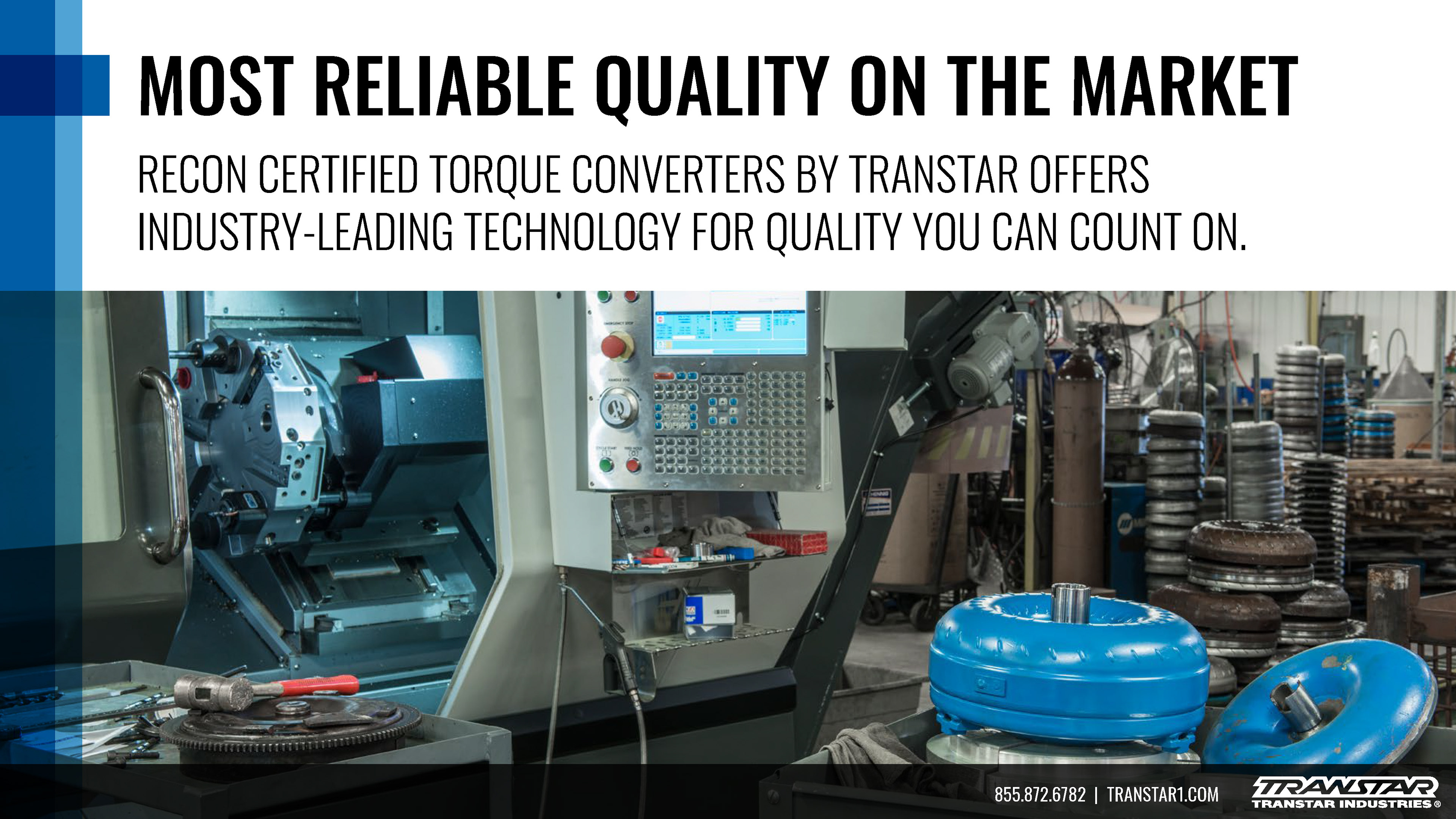
Execution
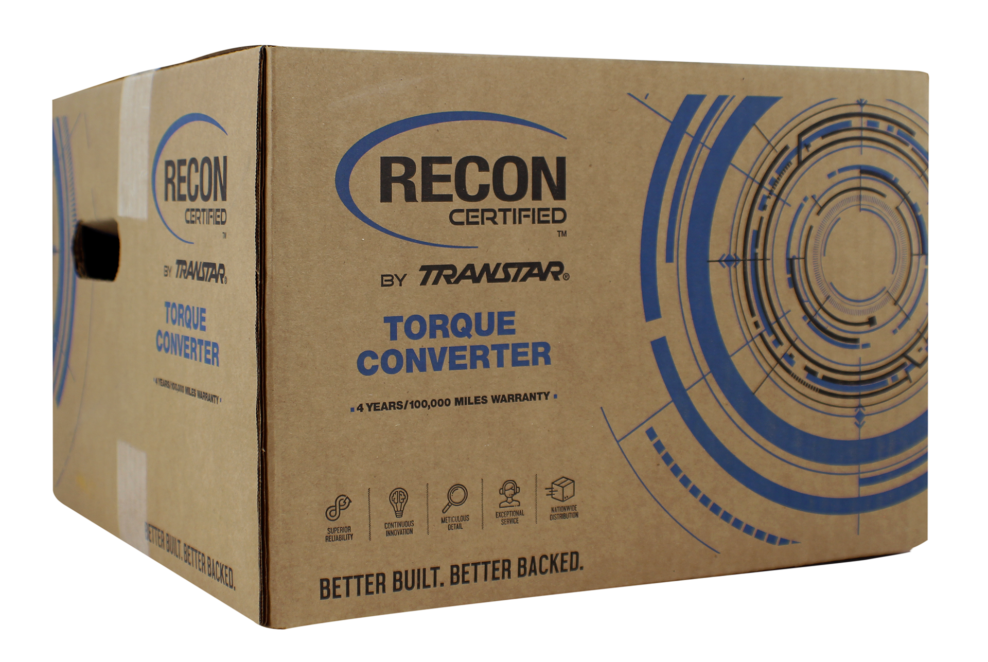
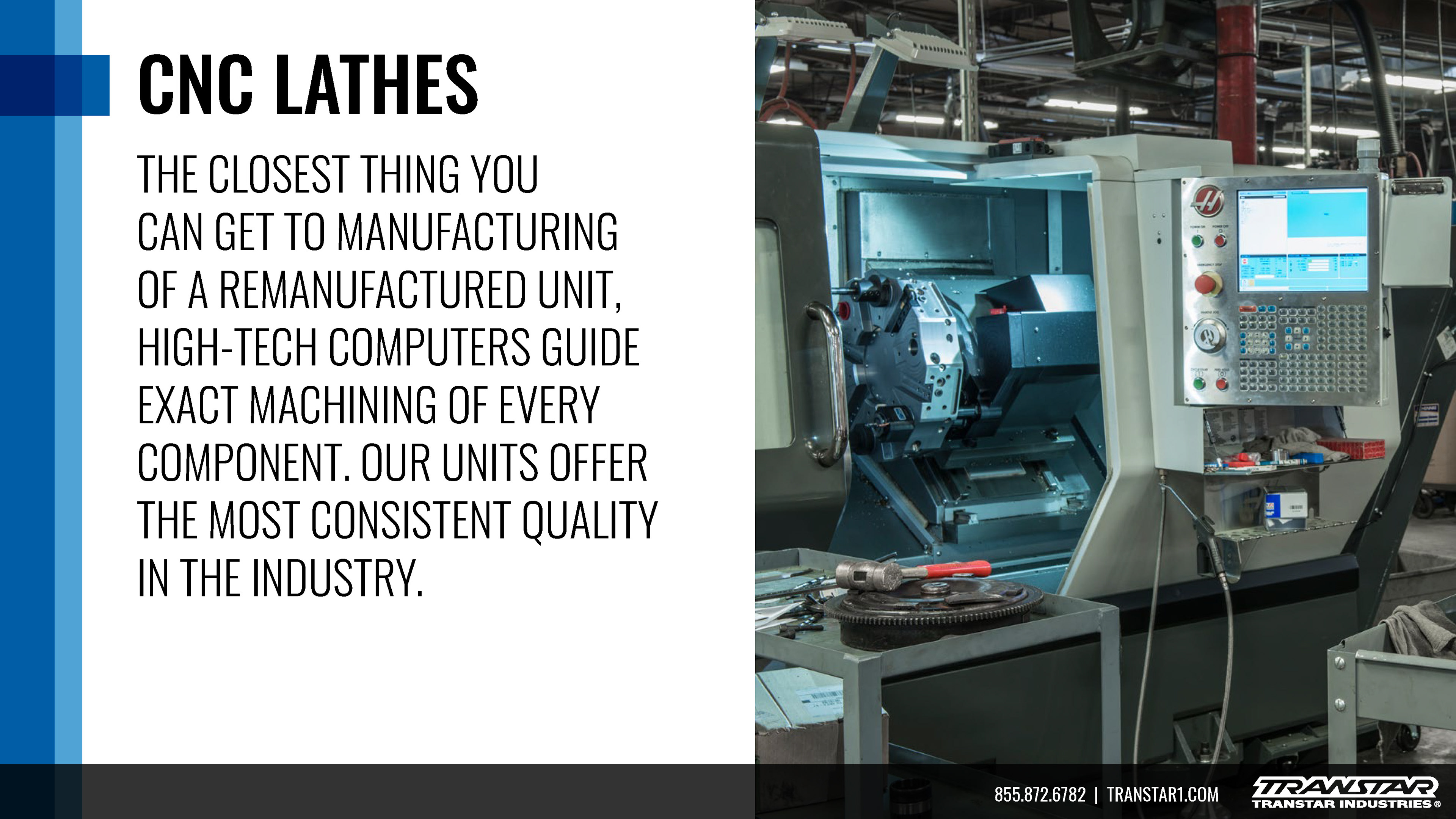
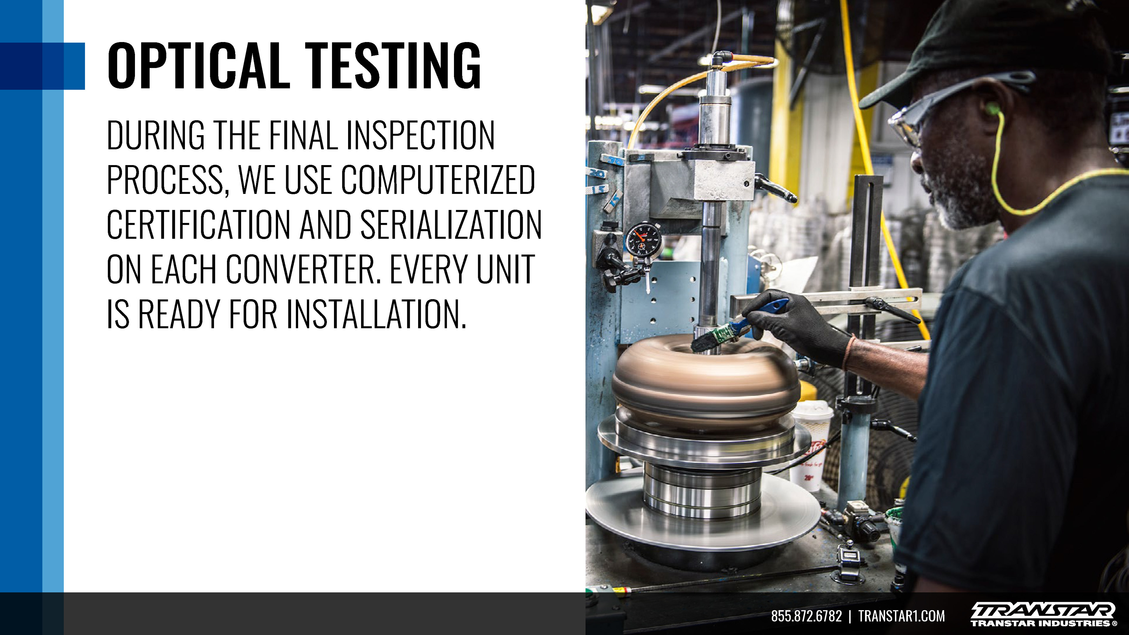
Packaging was the first test. I worked with printer specifications to create box designs where every side communicated clearly. Custom graphic elements such as shapes, textures, and patterns added the gritty, technical detail that the product’s audience values. For brochures, I mirrored the exterior of the box so the tri-fold design visually connected to the packaging. Inside I expanded the storytelling with exploded views of the torque converter, detailed callouts highlighting component quality, welder craftsmanship, and internal structure. On the digital side, I mocked up a website in Adobe XD that used photography and 3D visuals to show how the product was built and tested. I also created presentation decks and animated PDFs to tell the manufacturing story in a polished way.
Torque Converter Landing Page Mockup
Outcomes
The refresh gave the torque converter brand a look that was cohesive and confident. The packaging stood out on the shelf and at industry events. The brochure design encouraged attendees to pick it up and understand the product’s strength at a glance. Although the website was not built, the detailed mockups opened conversations about how to extend the identity online. Internal teams had new assets that felt purposeful and consistent. The visual identity elevated the product’s quality narrative and reinforced the manufacturing story.
Photo of Production Ready Torque Converter Packaging
Powerpoint Template


Key Takeaways & Next Steps
Working with print vendors reinforced how important specification sheets and early communication are. Small details like paper finish, dielines, and fold structure can make or break the final outcome. Sketching brochure folds helped me think in physical space and anticipate how users would interact with the piece. On the digital side, pushing mockups revealed the need for tighter UI and UX oversight to support a strong identity. If extended, this system could grow into motion graphics and video storytelling, as well as digital rollouts for web and social. Packaging could even be enhanced with AR visuals to showcase the product’s internal part.