Challenge
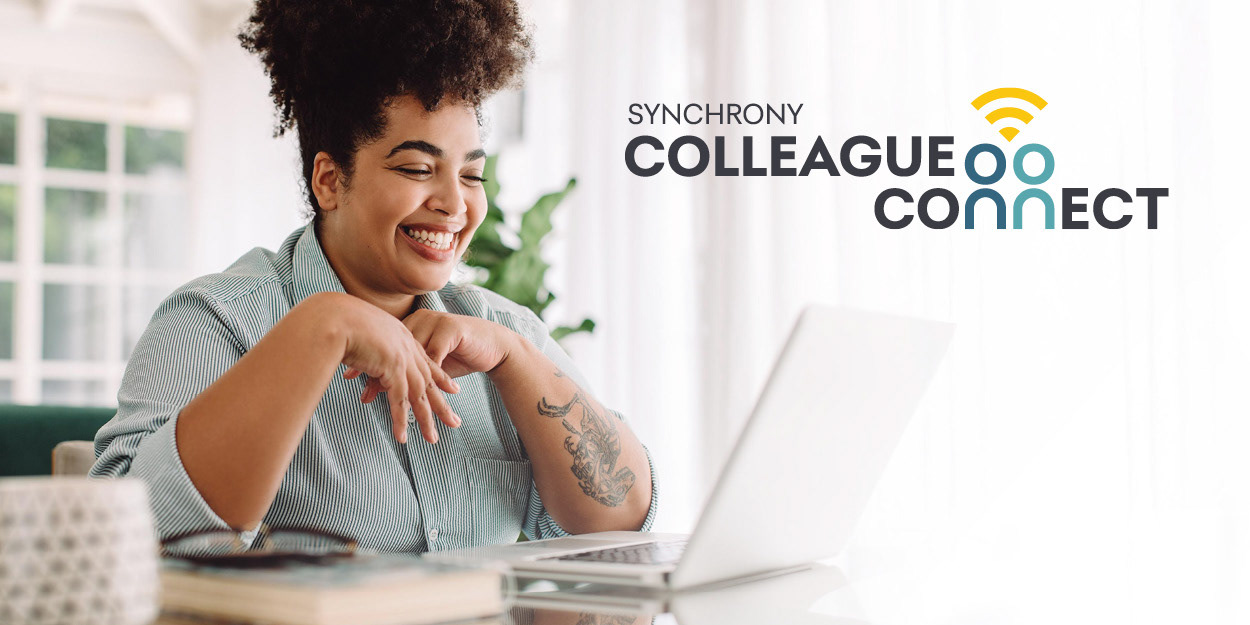
During COVID, as the world shifted remote, many Synchrony employees felt disconnected from their colleagues and company culture. To address loneliness and maintain engagement, Synchrony launched a program called Colleague Connect. They needed a logo that communicated connection, remote collaboration, and community in a way that felt true to their brand and optimistic about the future.
Approach
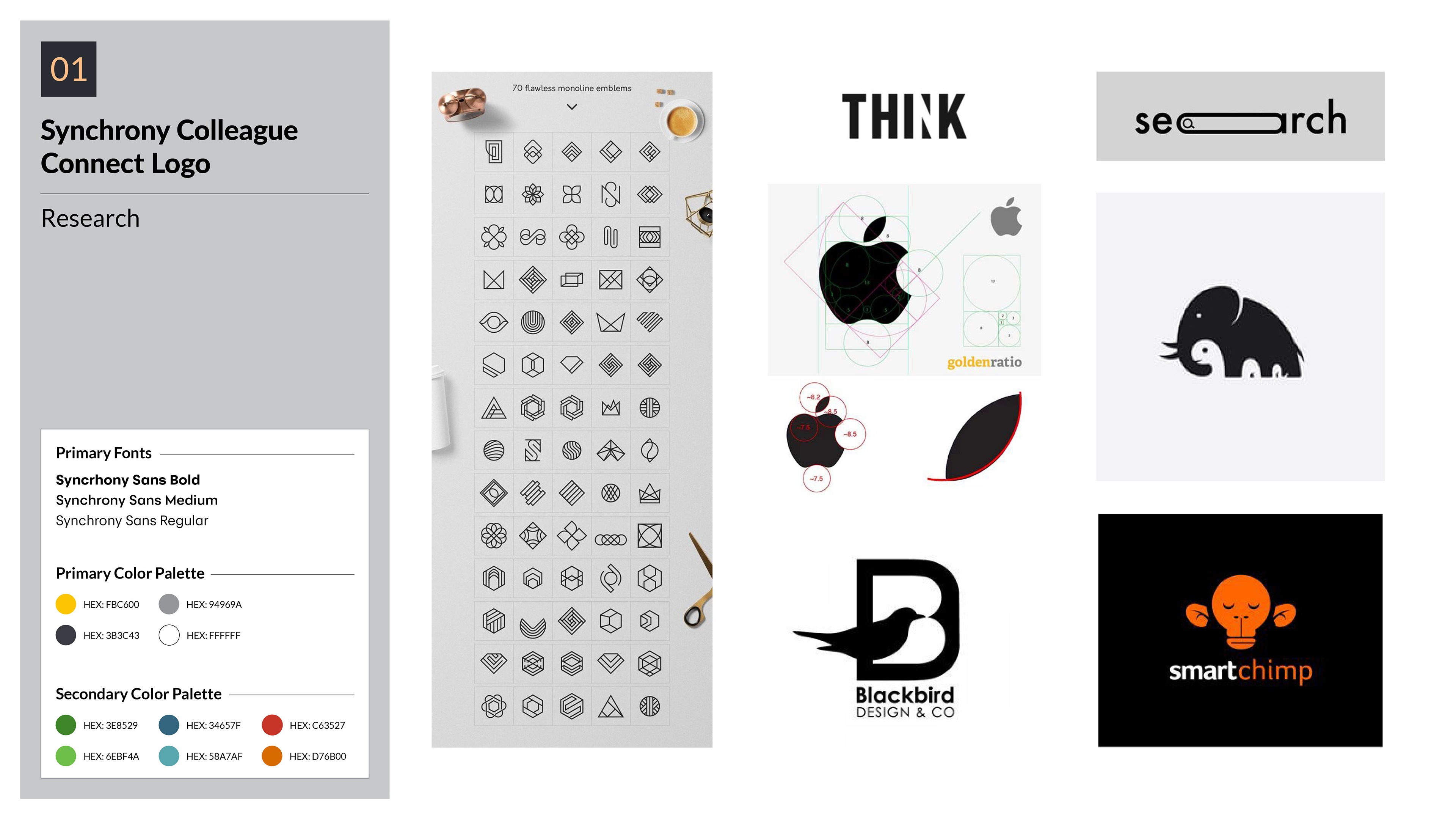
I started with research into remote work symbols and logos that evoke connection—wifi signals, overlapping shapes, circles, etc. I pulled inspiration from Pinterest boards, trend studies, and color palette explorations. I focused early on the letter “C” as central, since it appears in both “Colleague” and “Connect.” I built sketches around that, combining iconography like wifi arcs, clean typography, and Synchrony’s vibrant brand colors. Collaboration with the art director allowed refinement of concepts for simplicity and scalability.
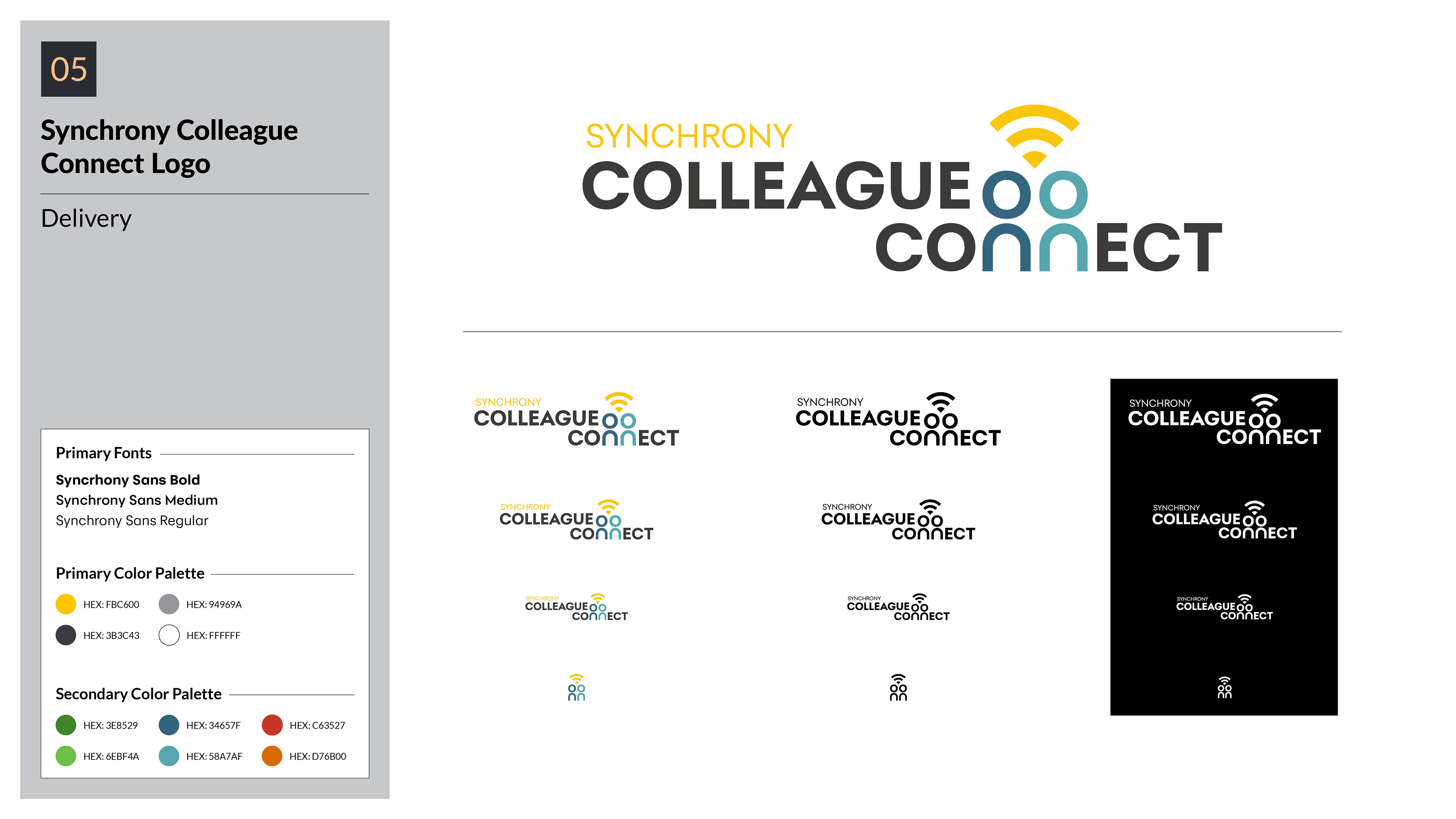
Execution
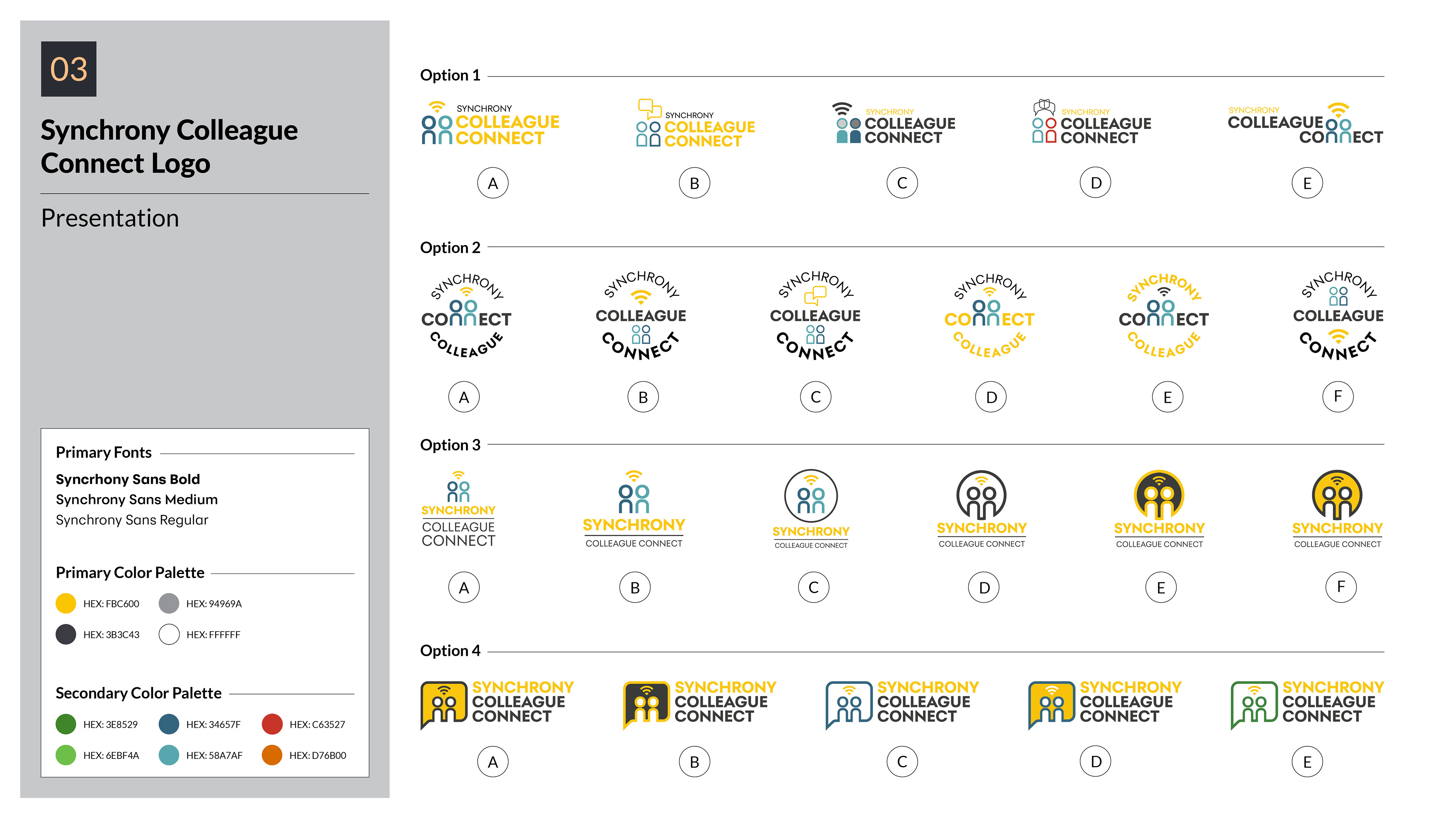
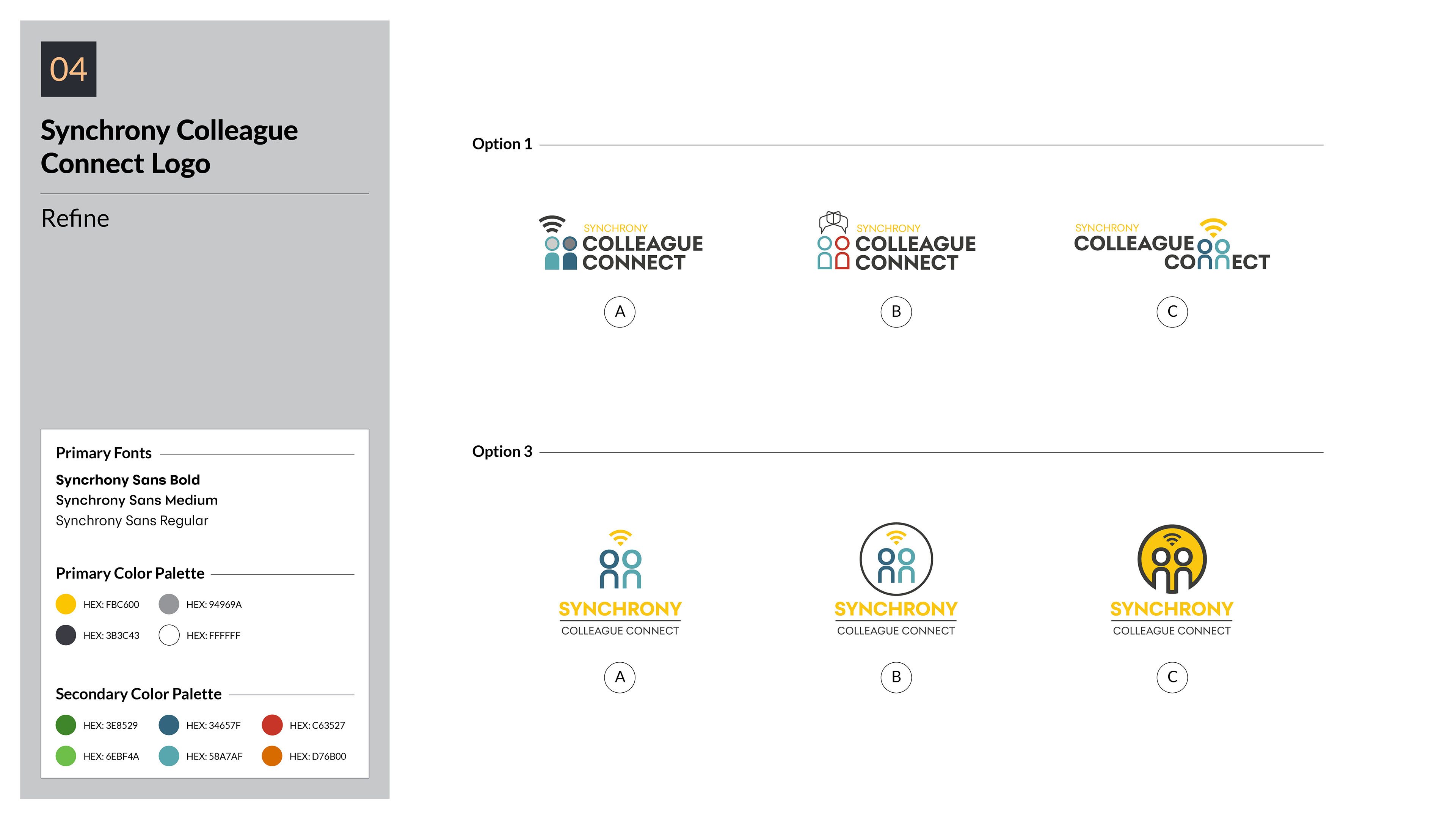
Using Illustrator, I developed multiple logo concepts. With feedback from my art director, I refined four promising designs and created mockups for each to test how they would scale (icon only, full logo, black/white, different sizes). We presented them to Synchrony, gathered notes, and polished the selected options. Eventually one of my designs was chosen. I delivered final files in full color, all-black, all-white, icon versions, and in a variety of sizes so that the logo could be used everywhere—from internal materials to digital assets.
Outcomes
The logo was adopted as the official symbol for the Colleague Connect initiative. It gave the program a visual anchor that fostered a sense of connection among employees working remotely. Synchrony had a consistent identity for the program: people saw the logo in internal communications, meetings, and materials, and feedback was positive about how “feelings of connectedness” came through visually. The multiple versions made it ready for different contexts right away.

Next Steps & Insights
Working through this project reinforced how important scalable design is: a logo must look good in icon form, in black/white, color, and at different sizes. I learned that early mockups help stakeholders visualize use cases and reduce surprises later. If expanded, this identity could be animated (subtle motion) to further communicate connection—like a pulsing “C” or subtle waves for remote work. Also worth exploring how this logo might integrate into motion graphics and internal culture videos to reinforce emotional impact.