Challenge
Synchrony needed location-specific PDF guides for each of its hubs around the world. These PDFs had to be functional, informative, and visually appealing—something people would actually want to use. At the time, Synchrony was in a brand limbo: the main identity guidelines were being reworked by a new agency, so there was flexibility but also uncertainty around what was “on brand.”
Approach
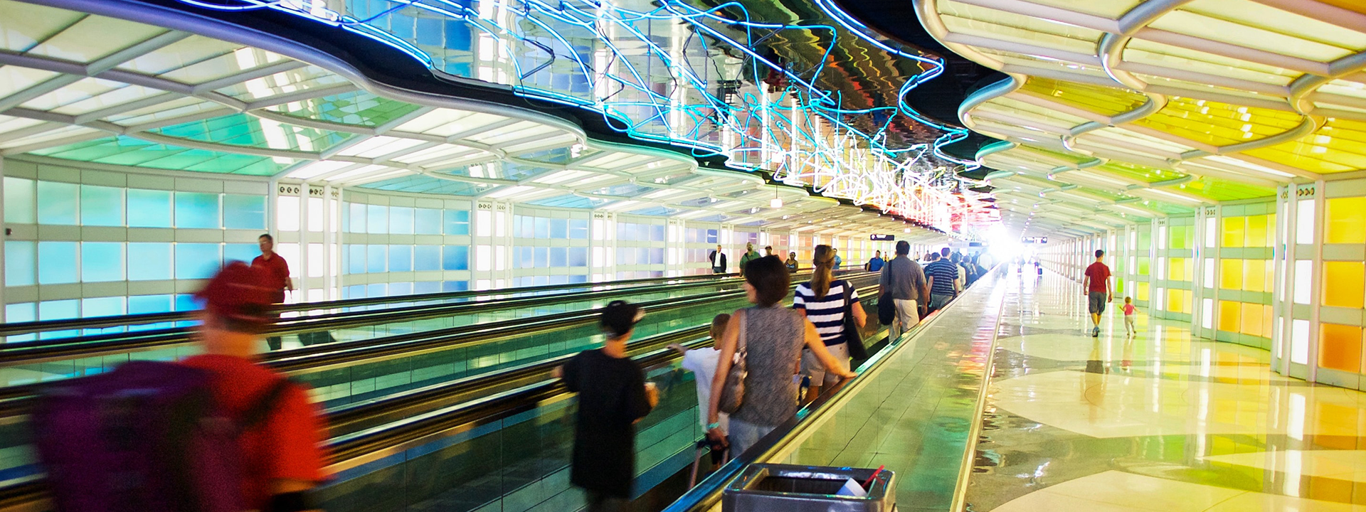
I leaned into that space of flexibility. I gathered as much photography of Chicago as I could, sourcing city shots that felt vibrant, welcoming, and distinct. I paired those with Synchrony’s branded photography and secondary color palette (brighter, more inviting than their typical grays and yellows) to build a more expressive, location-forward aesthetic. Since the guidelines weren’t fully locked, I felt empowered to explore visual styles, layouts, and graphic treatments that felt fresh and different.

Execution
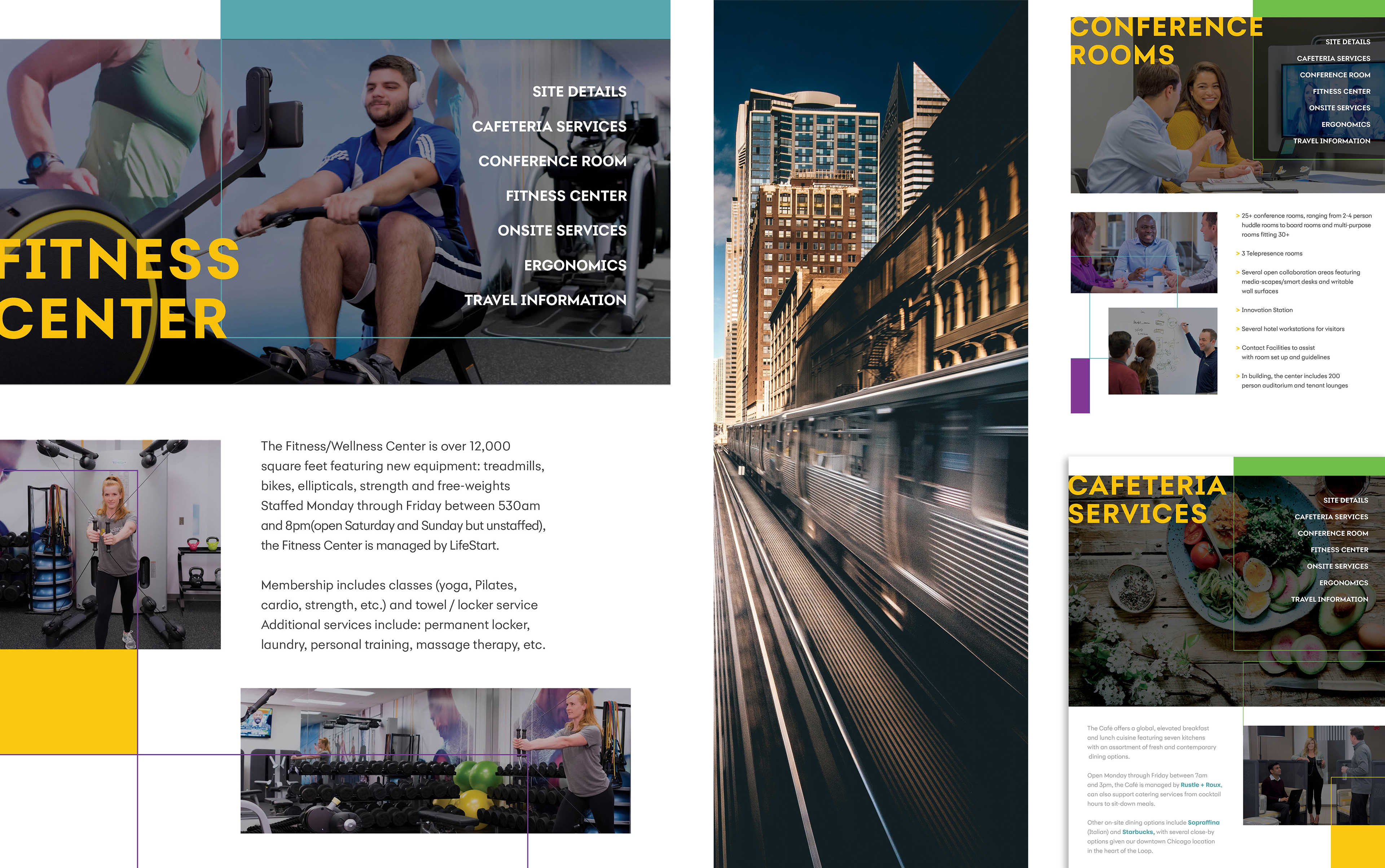
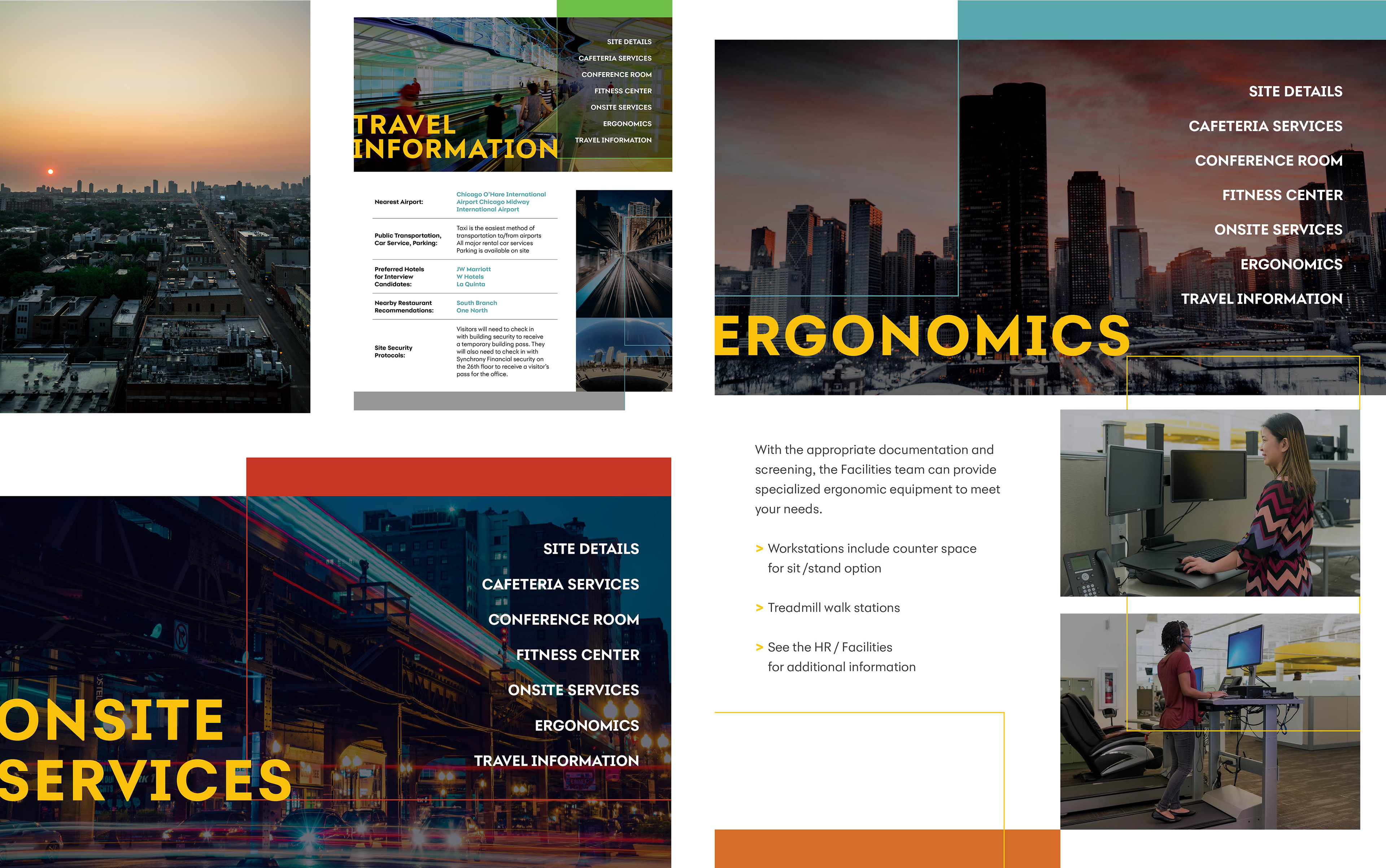
I designed an interactive PDF for the Chicago hub which included lots of local info: where to park, where to stay, hotspots to eat, etc. Layouts mixed photography, maps, icons, and clean typography. I iterated as I went—often experimenting with how much photography vs. branding elements to include, how the user would navigate the PDF, how to balance visuals with utility. Because each hub had unique needs, I made sure the Chicago version looked strong on its own but also felt like it could fit in with versions for Cambridge, New York, etc.
Outcomes
The Chicago interactive PDF was very well received. Internally people appreciated how beautiful and functional it was. It ended up influencing the new agency’s style work; some of the design treatments I used were incorporated into Synchrony’s updated brand standards. The piece also set a precedent: subsequent hub PDFs could be more adventurous with layout, color, and photography, because this one showed what was possible.
Next Steps & Insights
I learned that when brand guidelines are in flux, that’s a chance to experiment—but it’s critical to document what works so others can follow. Early access to photography and local resources makes a huge difference. I also saw the value of modular layout components so different local content (hotel options, parking, amenities) can swap in without breaking design. Moving forward I’d build a flexible template system for all hubs; also explore light motion or interactive web versions so people can map and explore digitally, not just via PDF.