
Challenge
After the pandemic, Synchrony faced serious hiring and retention challenges in its call center. Many employees were working remotely, but others couldn’t join due to lack of internet or childcare. Turnover rose, and it was hard to attract applicants quickly with the existing messaging. The ask was clear: launch something bold, simple, and effective on social channels that would directly address pay and benefits.
Approach
I joined the team in brainstorming sessions focused on what matters most to candidates—transparency, value, simplicity. The “$20/hour” message became the foundation: no confusing qualifications, just a clear offer. We decided animated social posts with big, bold copy would cut through noise. The creative leaned into urgency and clarity, using visuals that focused on message first, design second.
Execution
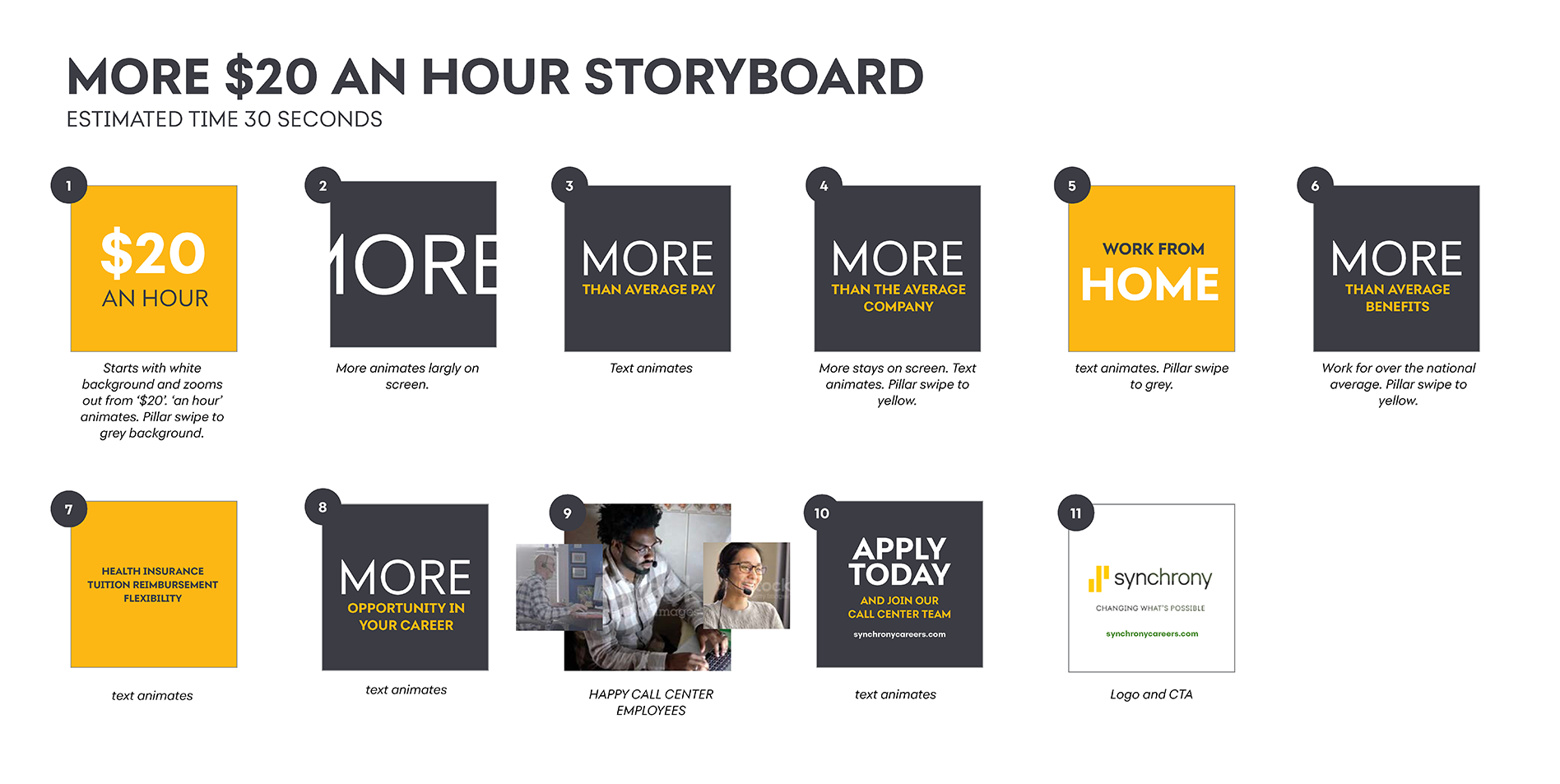
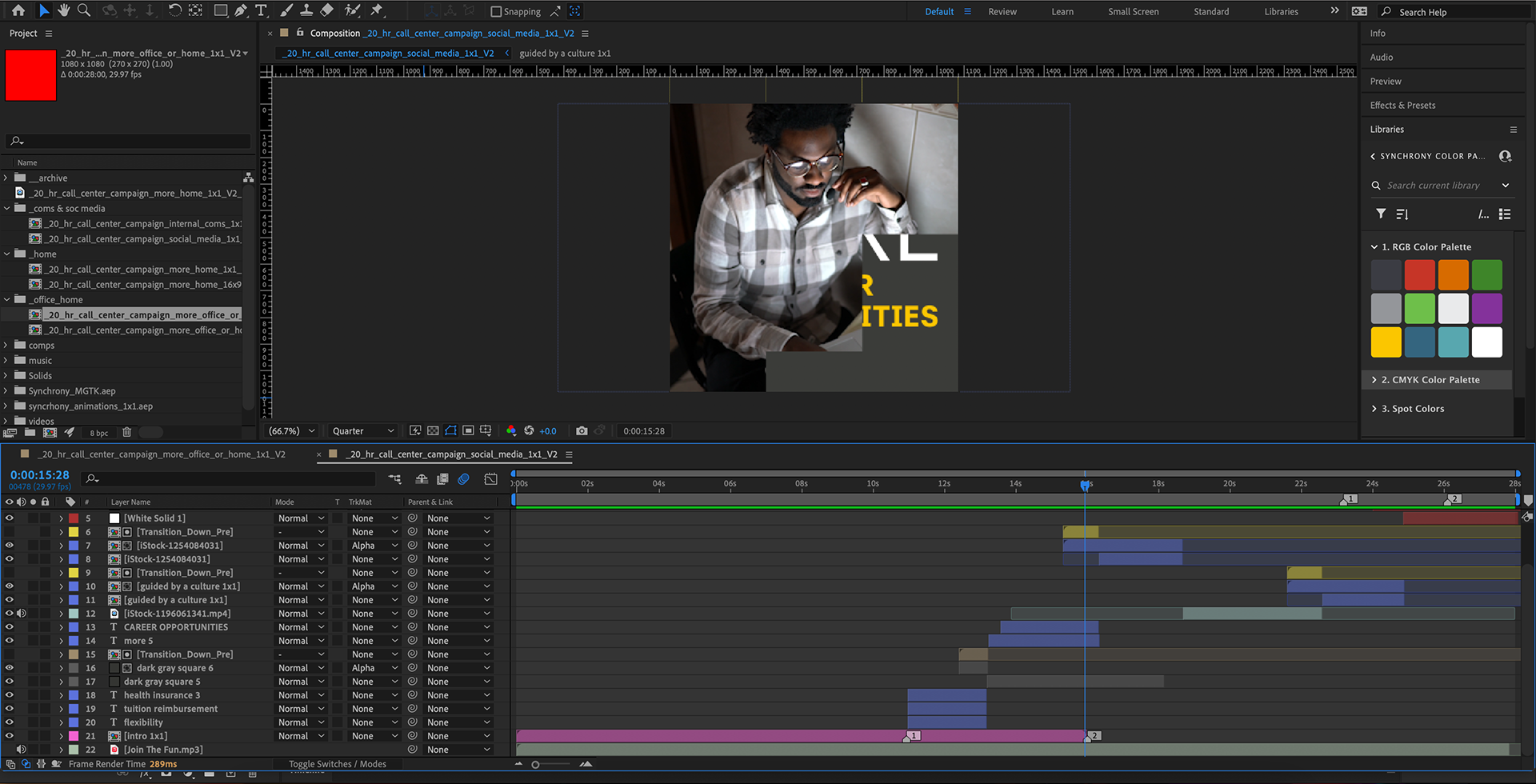
We storyboarded multiple animated posts for Instagram, Facebook, and other social platforms. Each version led with the pay rate, then layered in benefits like childcare, health care, tuition support. We designed animations with large typography, sharp contrast, and simple motion so that even when someone scrolls fast, the message lands. I handled the motion graphics build, refining timing and copy placement to maximize clarity. The bilingual incentive was added mid-campaign, which required quick updates to ensure consistency.
Outcomes
The campaign caught attention right away. One of the animated posts got more than 5,000 impressions on the first day. There was a measurable uptick in applicant volume and full-time hires in the call center. Internal feedback praised how clear and direct the messaging felt, and the campaign drove more traffic to apply with fewer barriers. Social engagement was strong and the visual identity felt cohesive with Synchrony’s broader employer brand.
Final animation
Next Steps & Insights
This project taught me that simple, direct messaging is often the most powerful in recruiting campaigns. Designing with clarity first helps carry the message even when attention spans are short. Quick iteration around content (like the bilingual bonus) matters for sustaining momentum. Going forward I’d test variations of motion (subtle vs bold), build more modular animation templates for speed, and incorporate A/B testing of copy and imagery to find what drives the strongest applicant response.