
Challenge
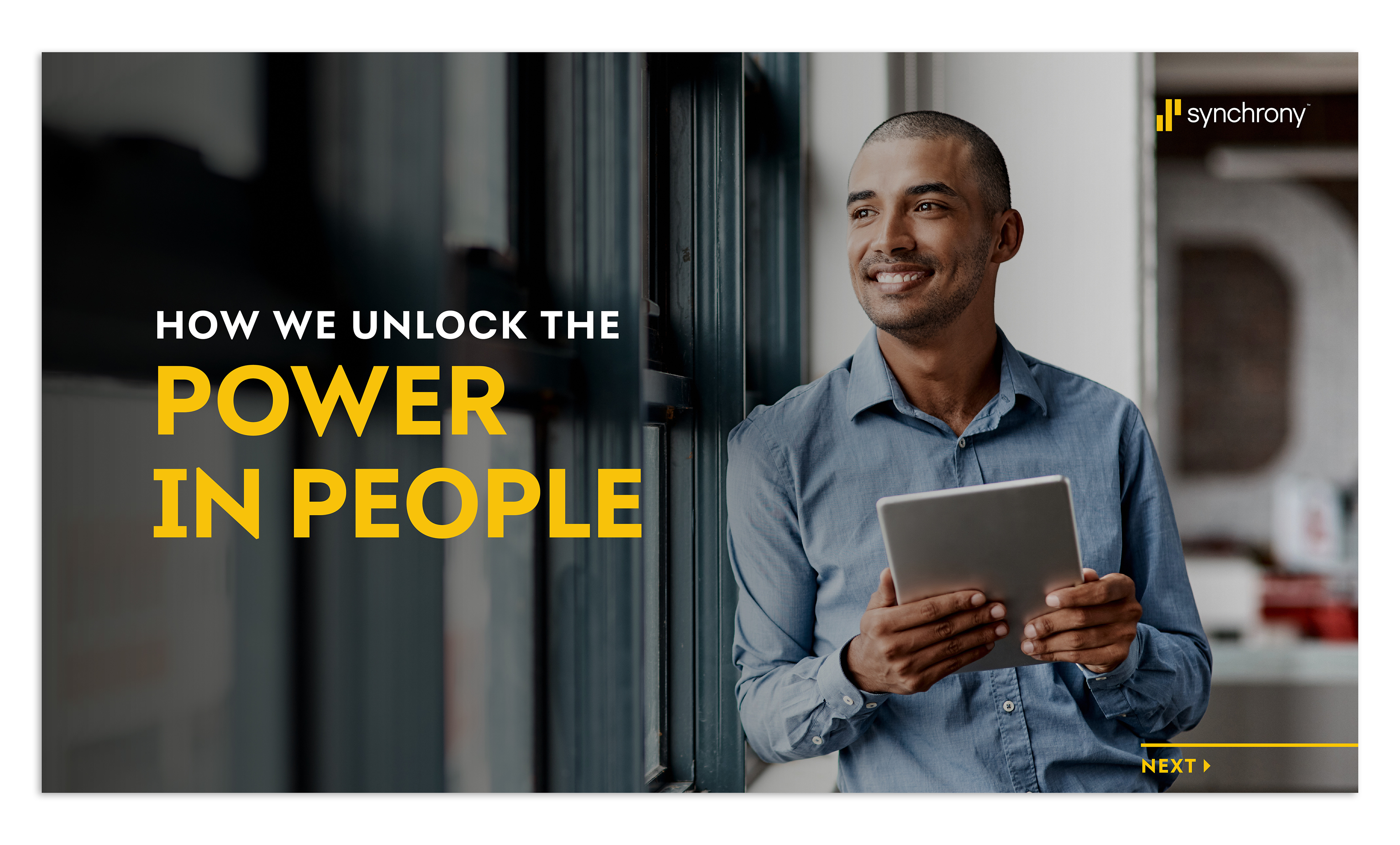
Synchrony wanted a perks & benefits document that could work both internally and externally, and they wanted it to impress. The original version was too dense—too much content, mixed messages, not enough clarity. The goal became making something clean, concise, visually engaging, and easy to navigate while still covering all the essential info.
Approach
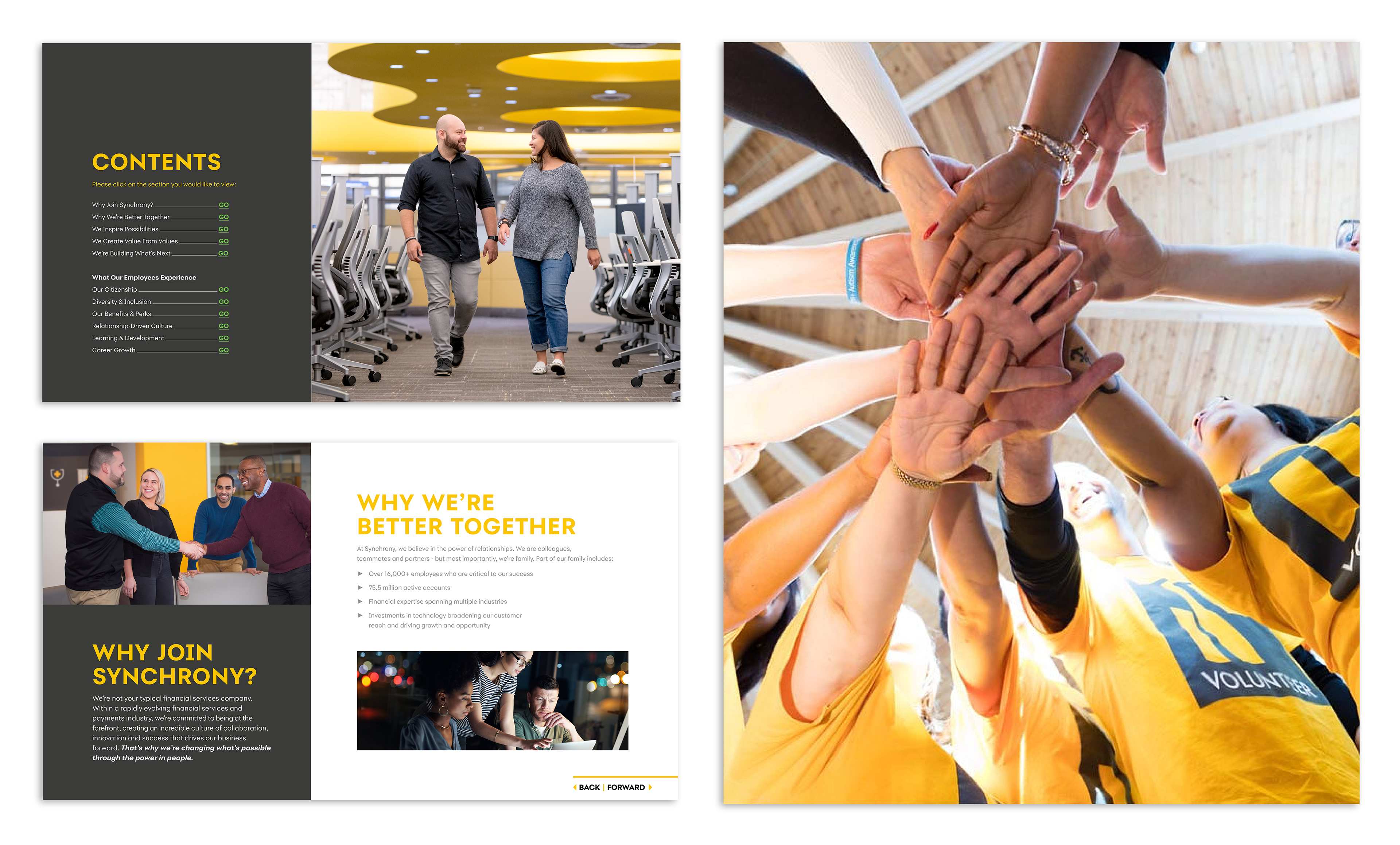
I started by reading through everything—every benefit, perk, policy—and listing what felt necessary, what was redundant, and what might add value. From those early audits and conversations with HR content owners, I pushed for trimming: cutting away anything that didn’t speak directly to what motivates people. Then I structured the flow so the strongest perks show up early and the layout guides users naturally through details without overwhelming them.
Execution
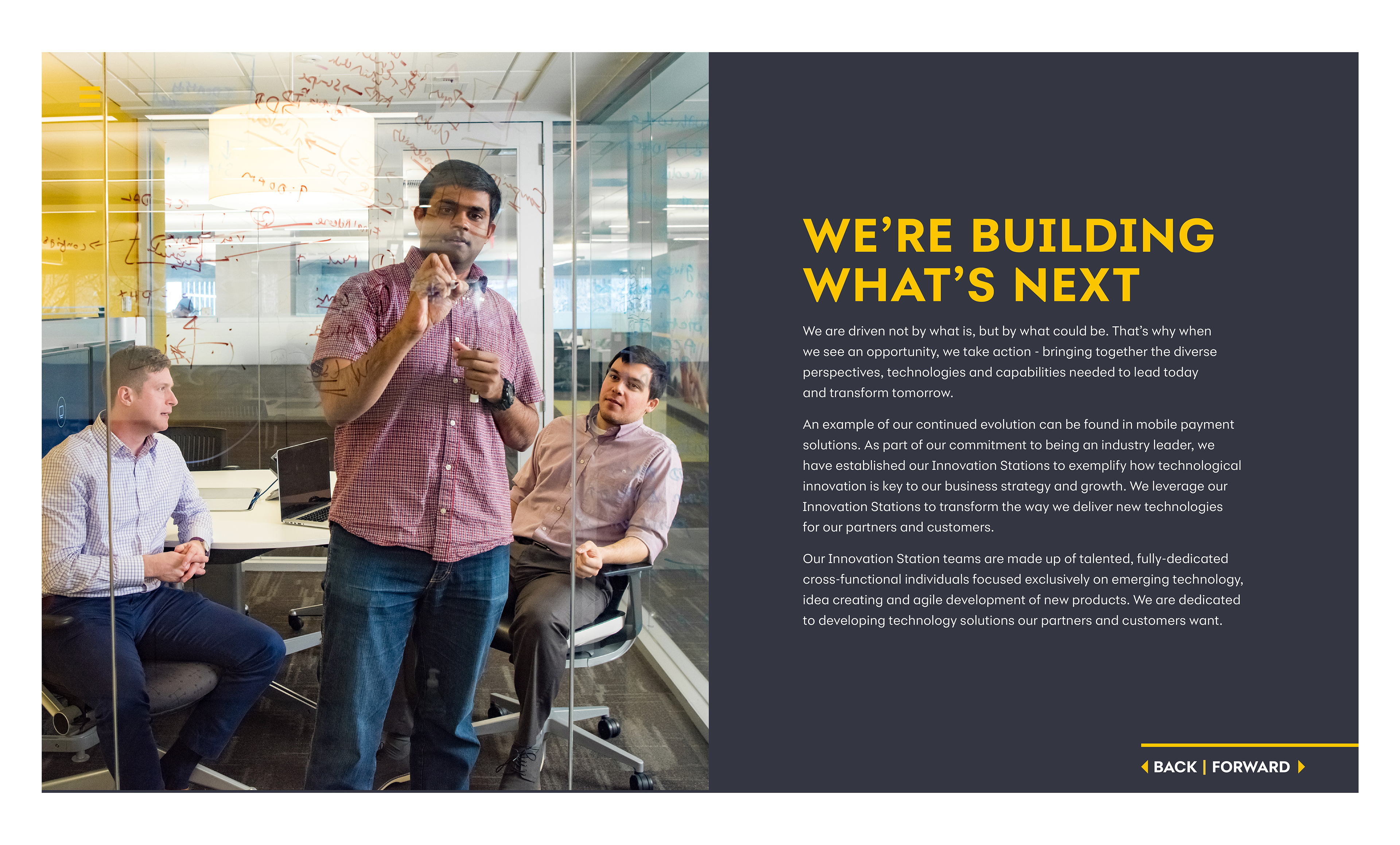
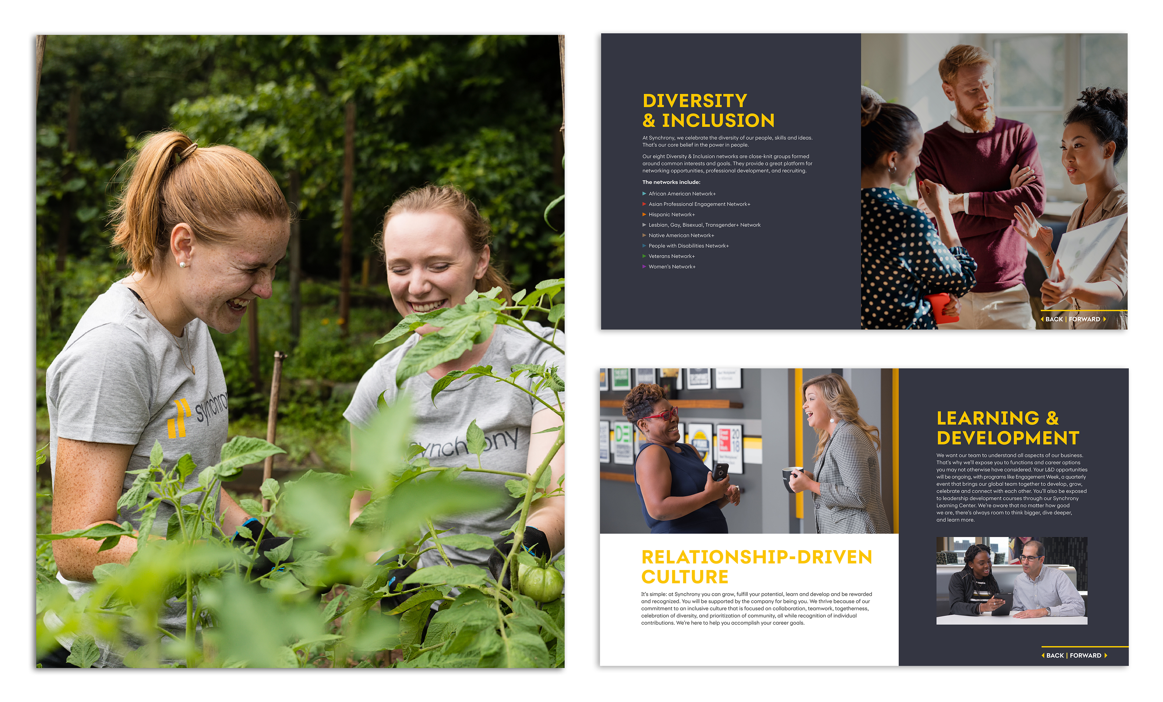
I designed the PDF to be interactive: clickable sections, clean navigation, polished visuals. Graphics and icons were applied to break up text and communicate ideas visually. Typography hierarchy was adjusted so headings, sub-titles, and body content all felt distinct. Assets were optimized so the file size stayed reasonable while preserving quality. After previews and feedback from HR leaders and VPs, I refined layouts, rebalanced white space, and simplified sections that still felt too heavy.
Outcomes
The end product landed well. Synchrony’s HR team, VPs, and external partners praised both the aesthetic polish and the clarity of content. The interactive PDF got used in recruiting, onboarding, and internal communications. It made it much easier for people to understand what Synchrony offers, why working there is meaningful, and helped communicate the perks without jargon or filler.

Next Steps & Insights
Trimming content is powerful. You lose nothing by removing what doesn’t help guide someone toward understanding or excitement. I saw again how important navigation structure is in interactive documents: users need to find what they want fast. For future pieces I’d build in even more micro-interactions (hover states, embedded media) to make them more immersive. Also want to test shorter teaser versions of these documents for social sharing and email follow-up so the message can reach people who won’t open a full PDF.