Challenge
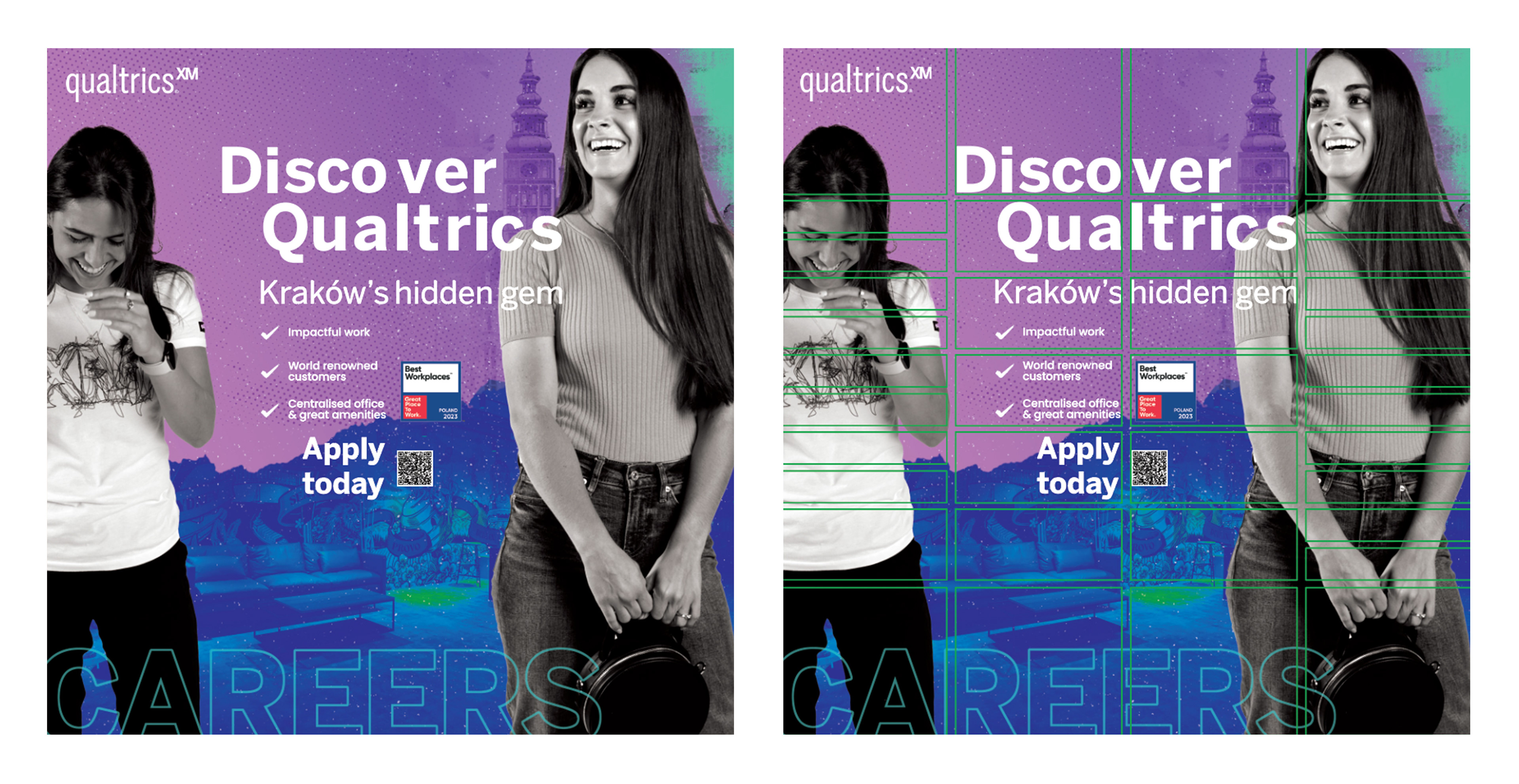
Qualtrics needed a recruiting campaign for its Kraków offices that felt fresh and modern yet still connected to its evolving brand identity. The goal was to attract talent by showcasing not just the job, but the lifestyle, the office environment, and the vibrancy of the city itself. There were constraints: the brand was mid-rebrand, so color strategy was still under discussion, and there were strict layout limitations for lockups such as train station lockers where physical space and vendor specifications mattered.
Approach
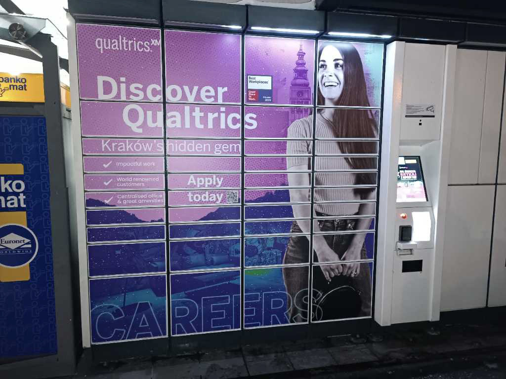
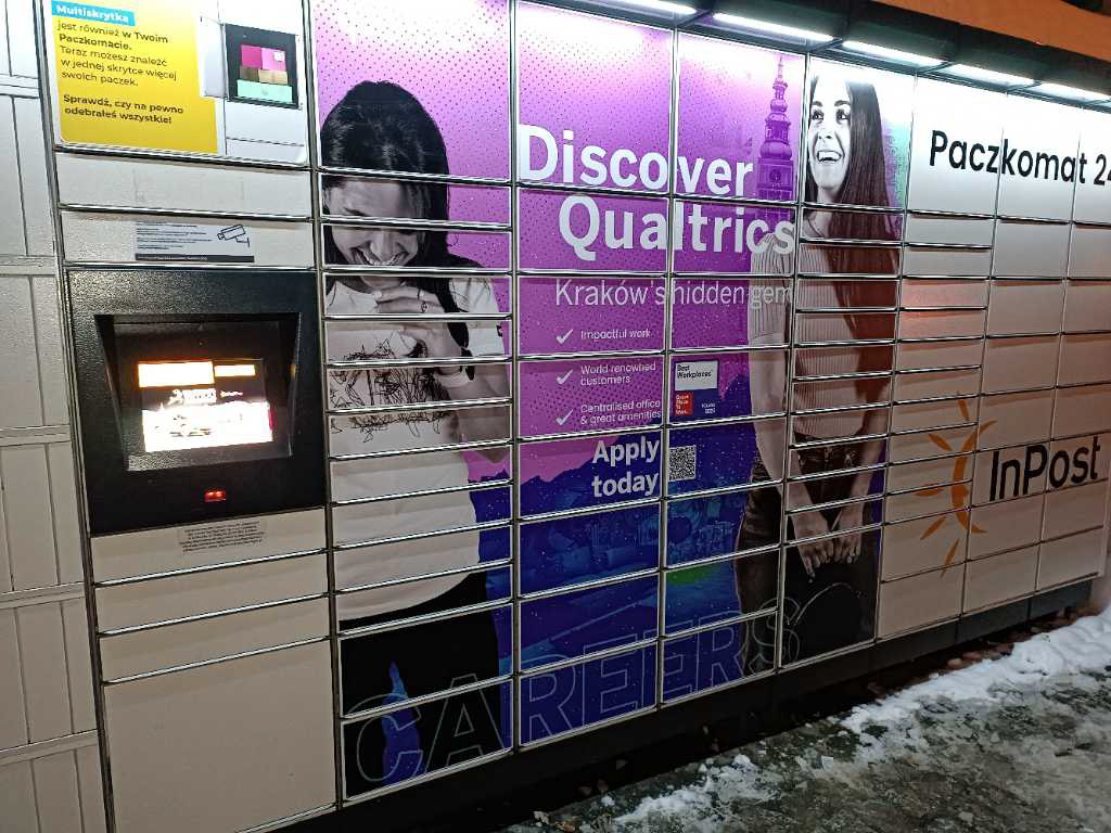
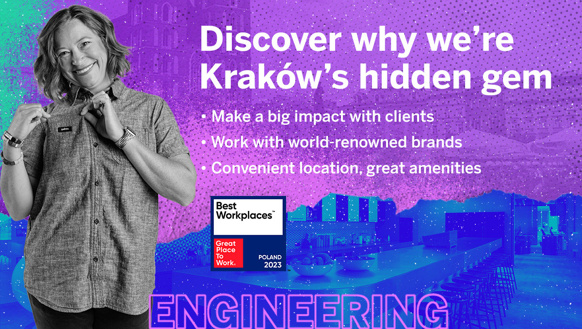
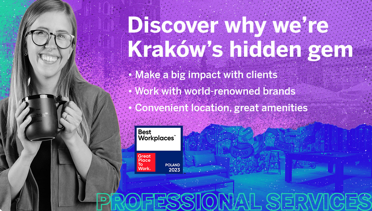
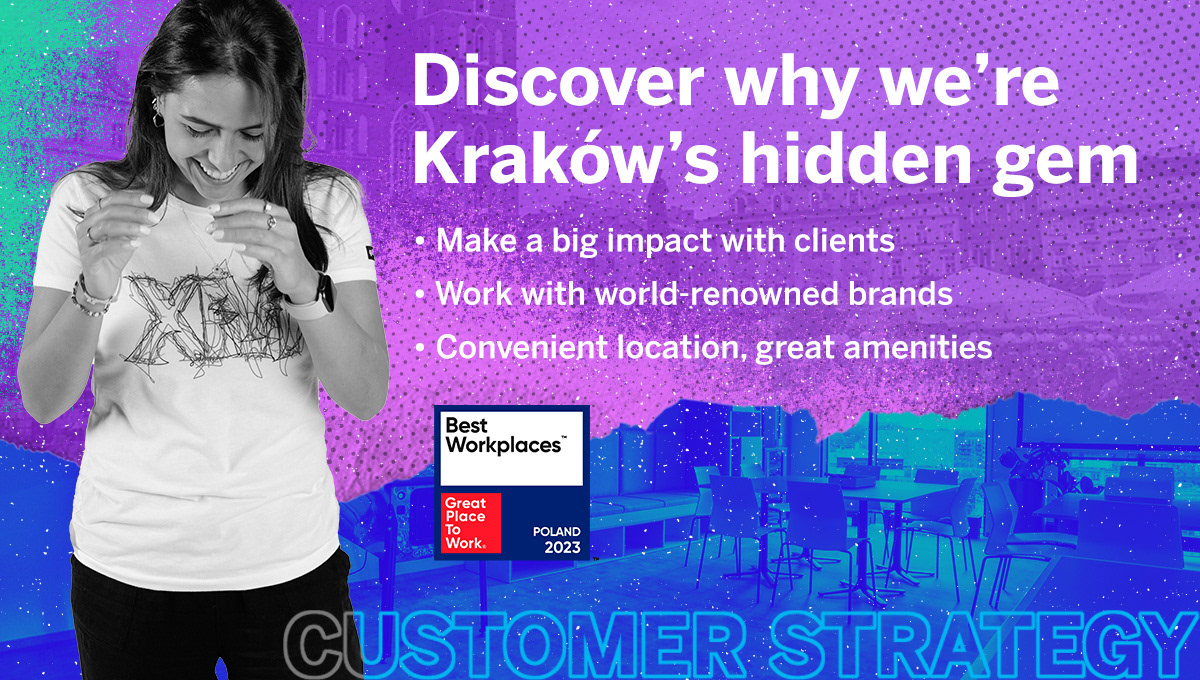
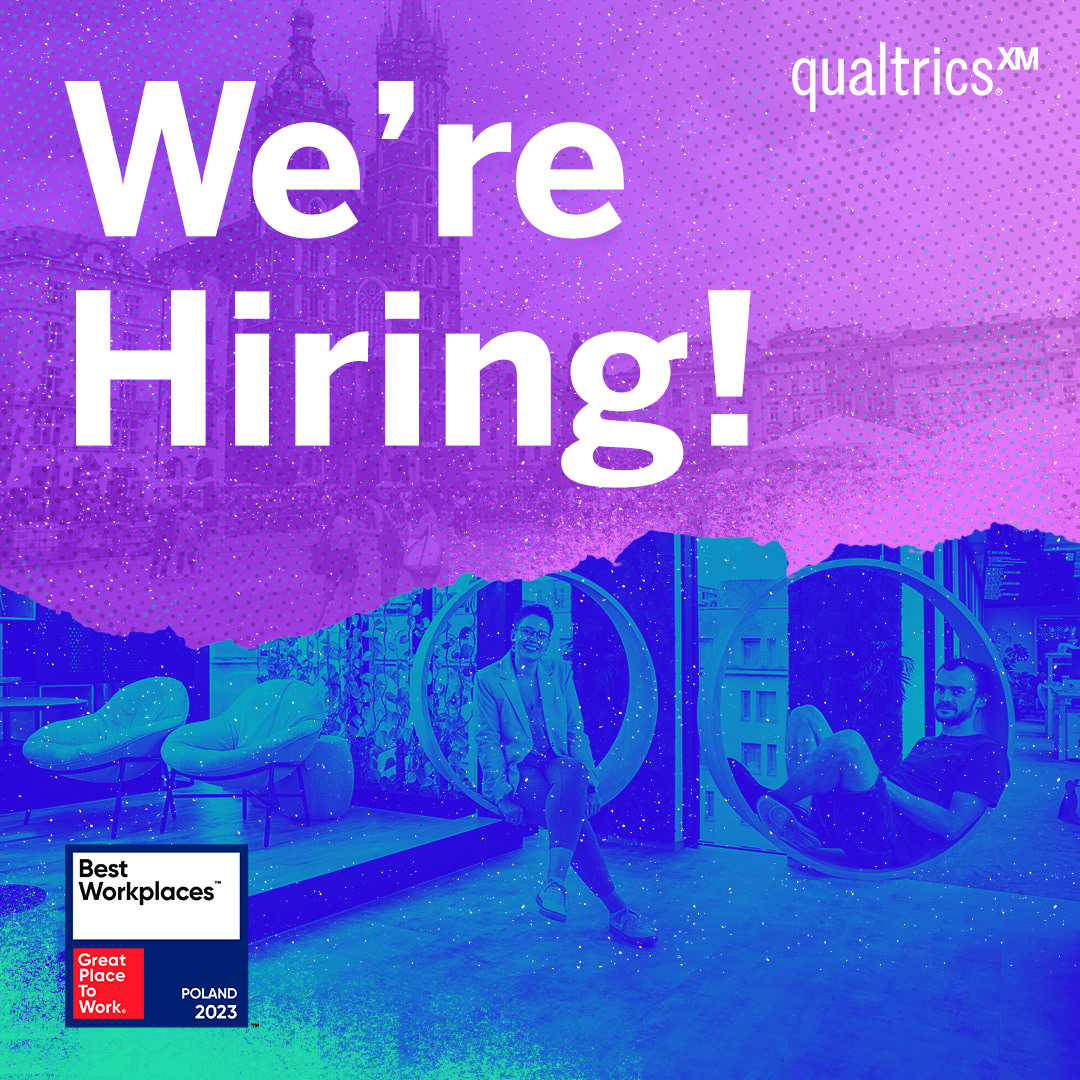
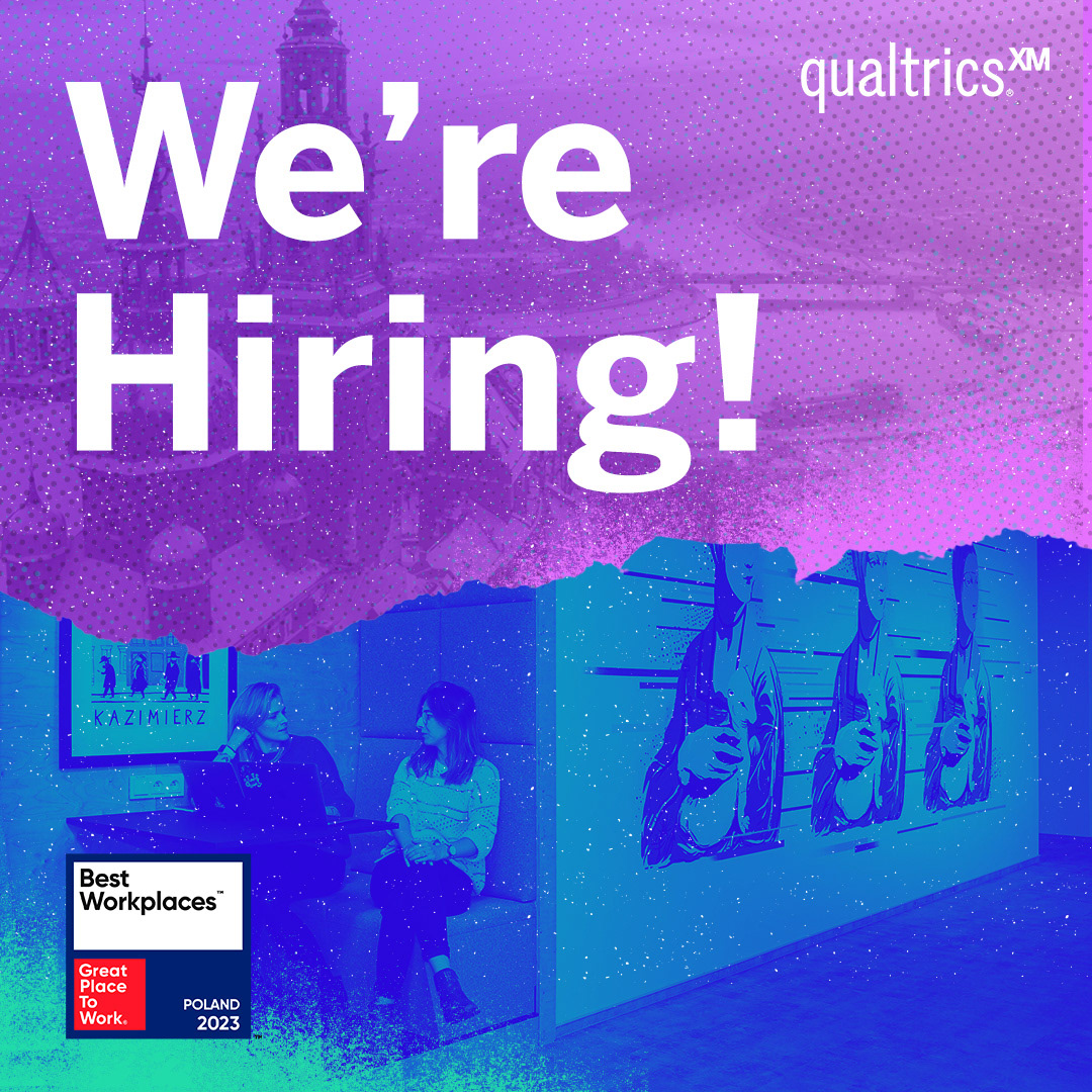
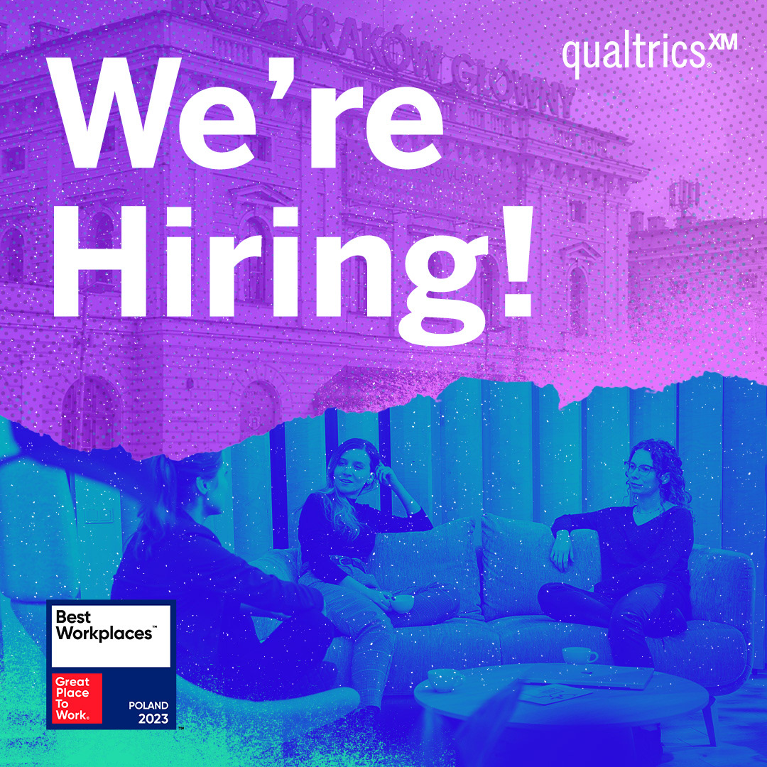
I began by reviewing everything Qualtrics had—photos, logos, textures, animations—so I could build on what already worked. I drew inspiration from Kraków: its architecture, street scenes, culture. To respect the changing brand identity, I adapted the emerging color palette, ensuring purple, green and blue hues felt balanced and dynamic. I intentionally chose black-and-white photography in place of duotone treatments to give contrast and allow layouts to pop against the vibrant colors. Early sketching and layout exploration were essential, especially to understand how designs would map across physical surfaces like lockers.
Branded Animation
Execution
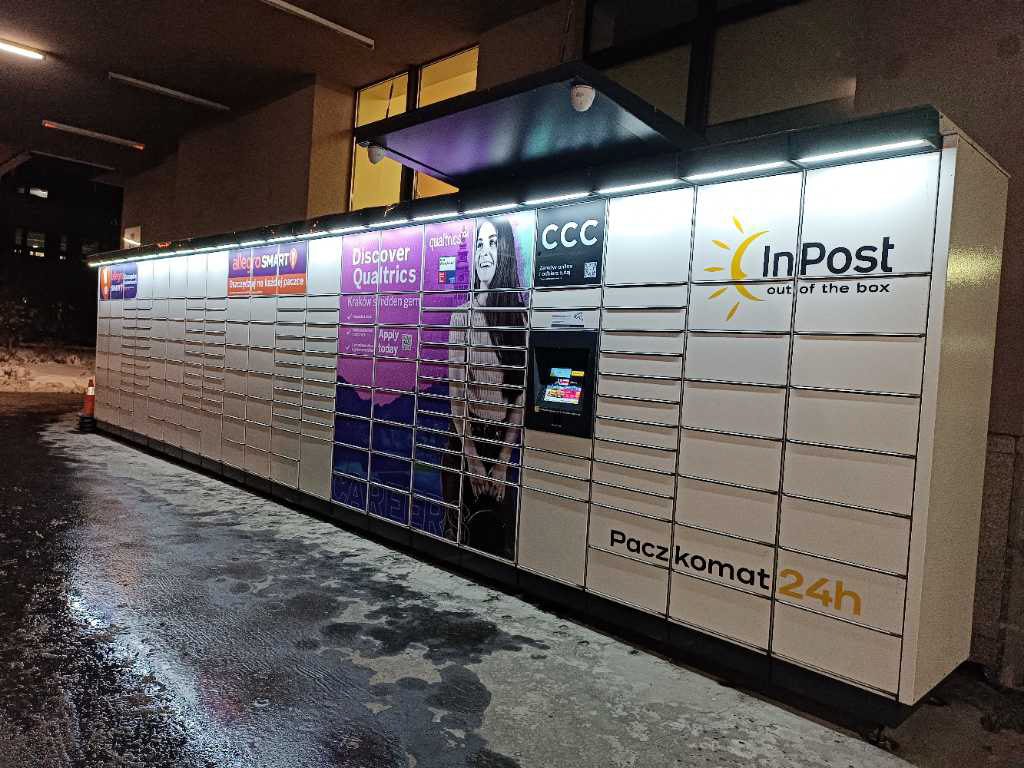
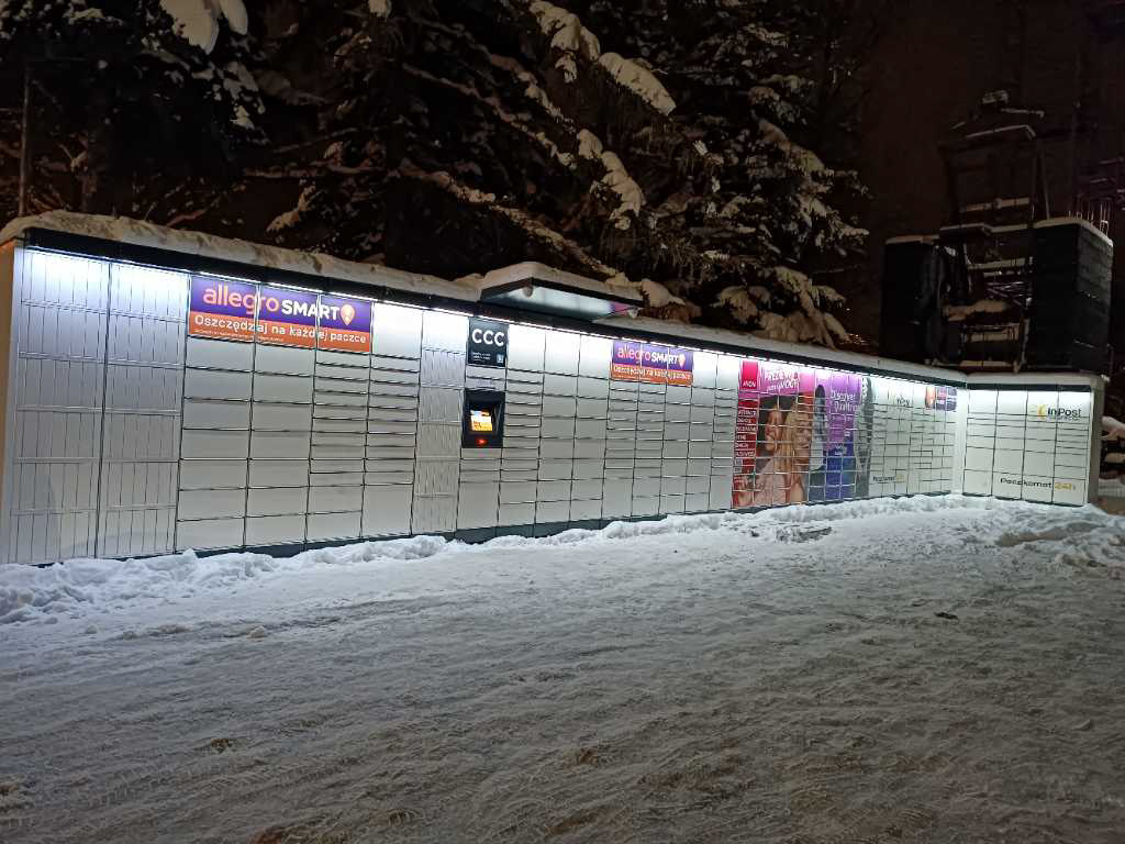
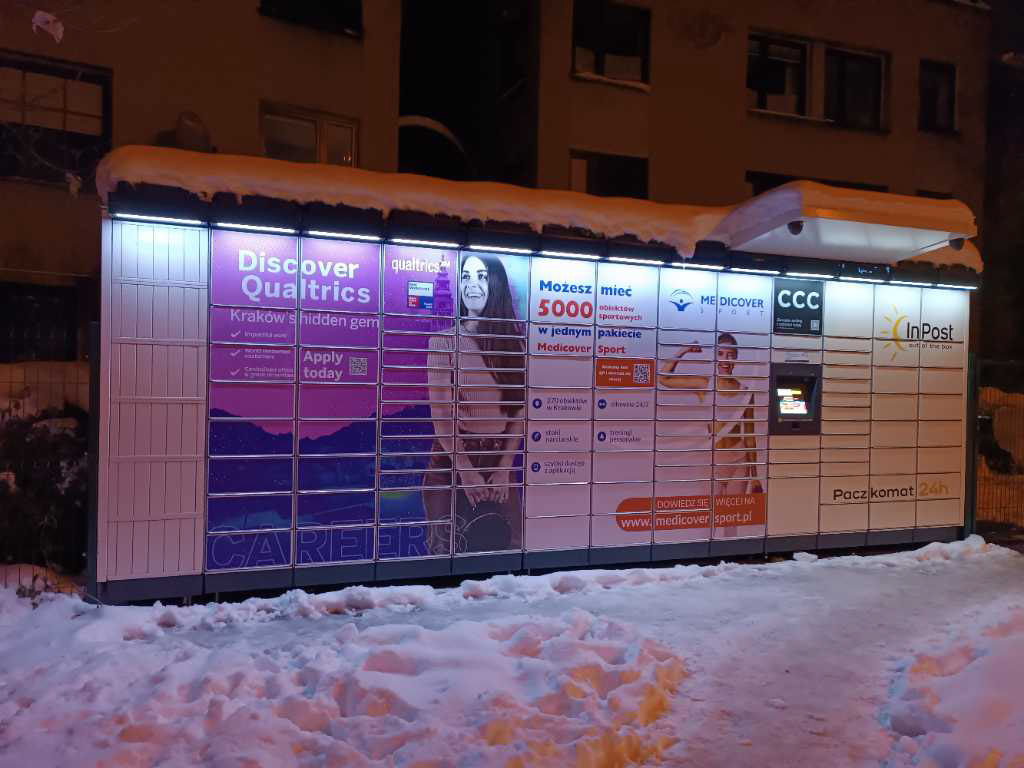
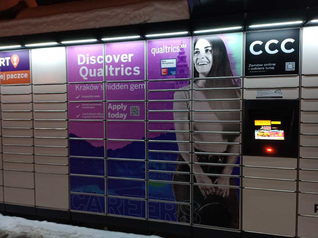
With initial layouts approved, I tackled one of the toughest parts: designing for the twelve different train station locker formats. I had to respect vendor requirements—no text overlapping gaps, consistent kerning, and visual elements that translated across all locker sizes. I worked closely with the vendor in Poland, accommodating time-zone and language differences, iterating designs until all layouts aligned. After printing produced the assets, I supervised their installation to ensure fidelity. Then I created matching social media assets based on the locker campaign design so the message carried across digital and physical touchpoints.
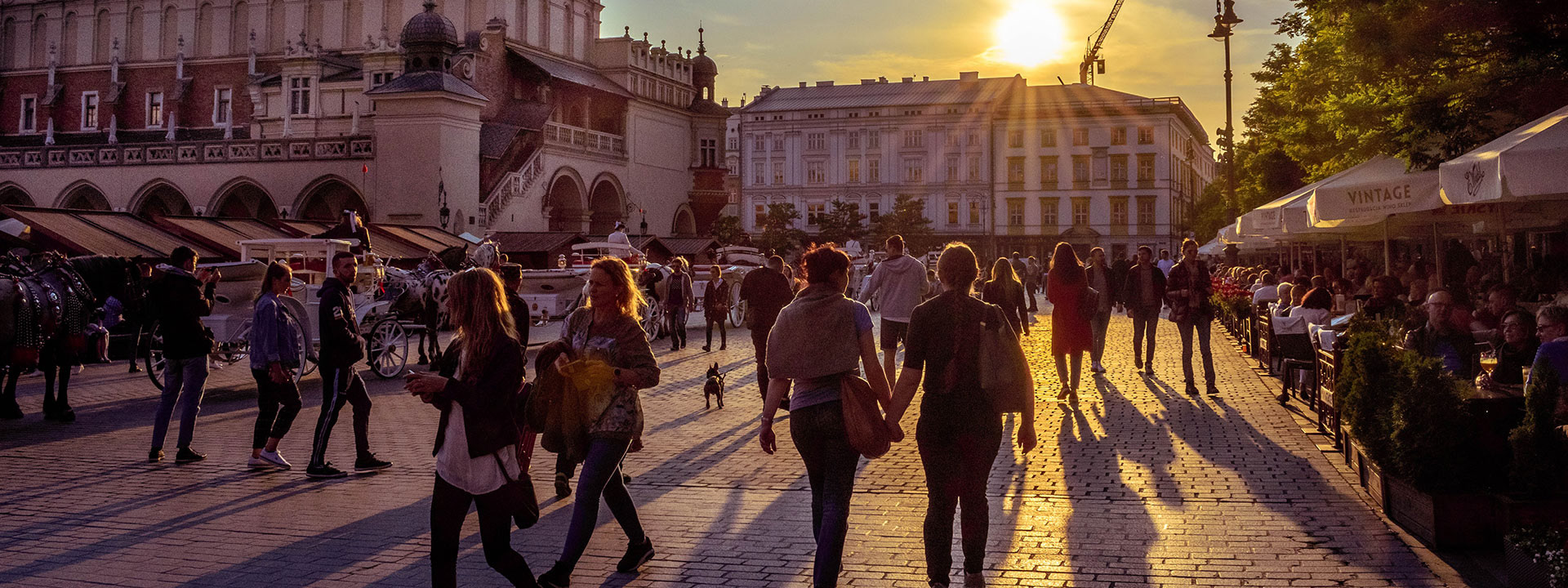
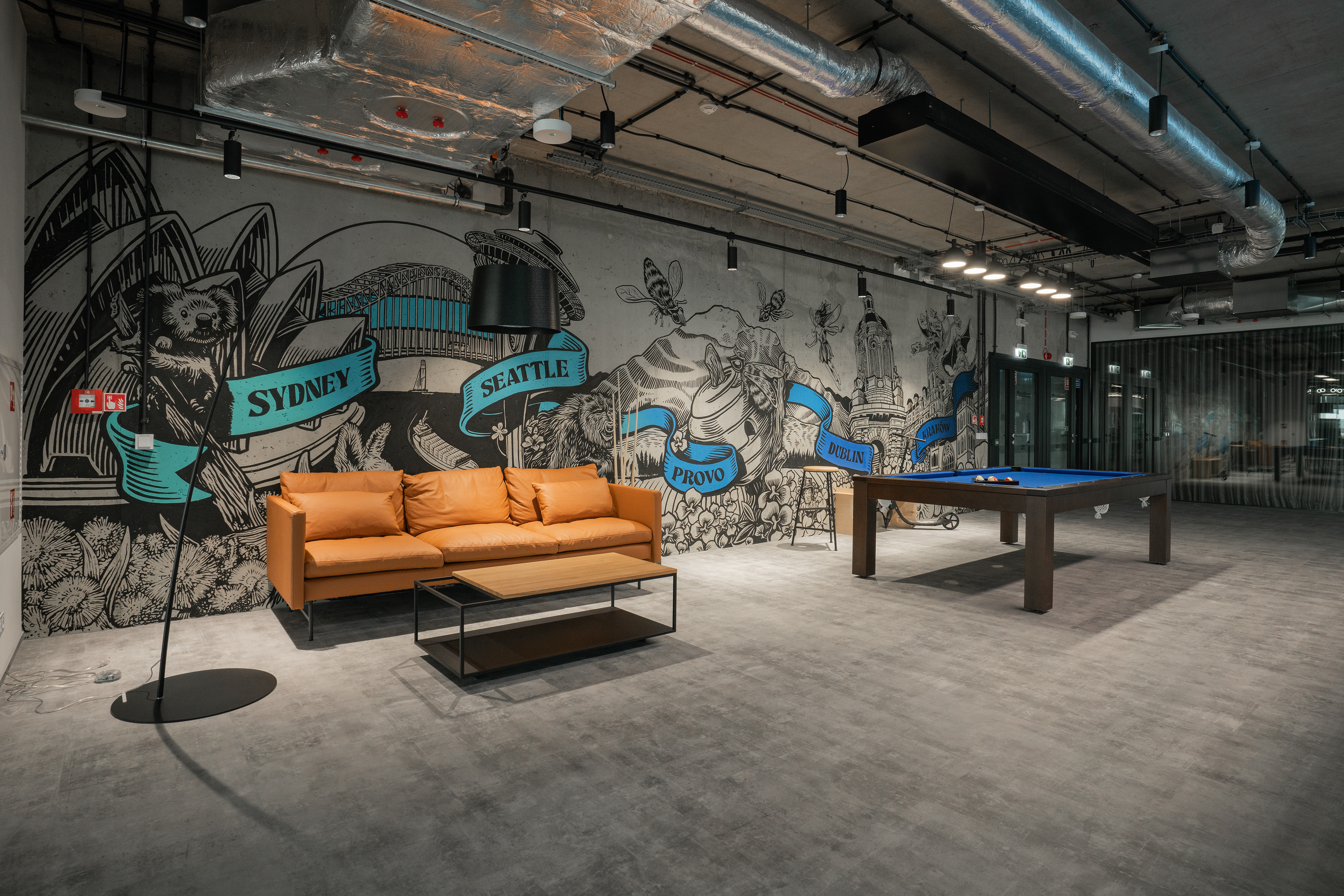
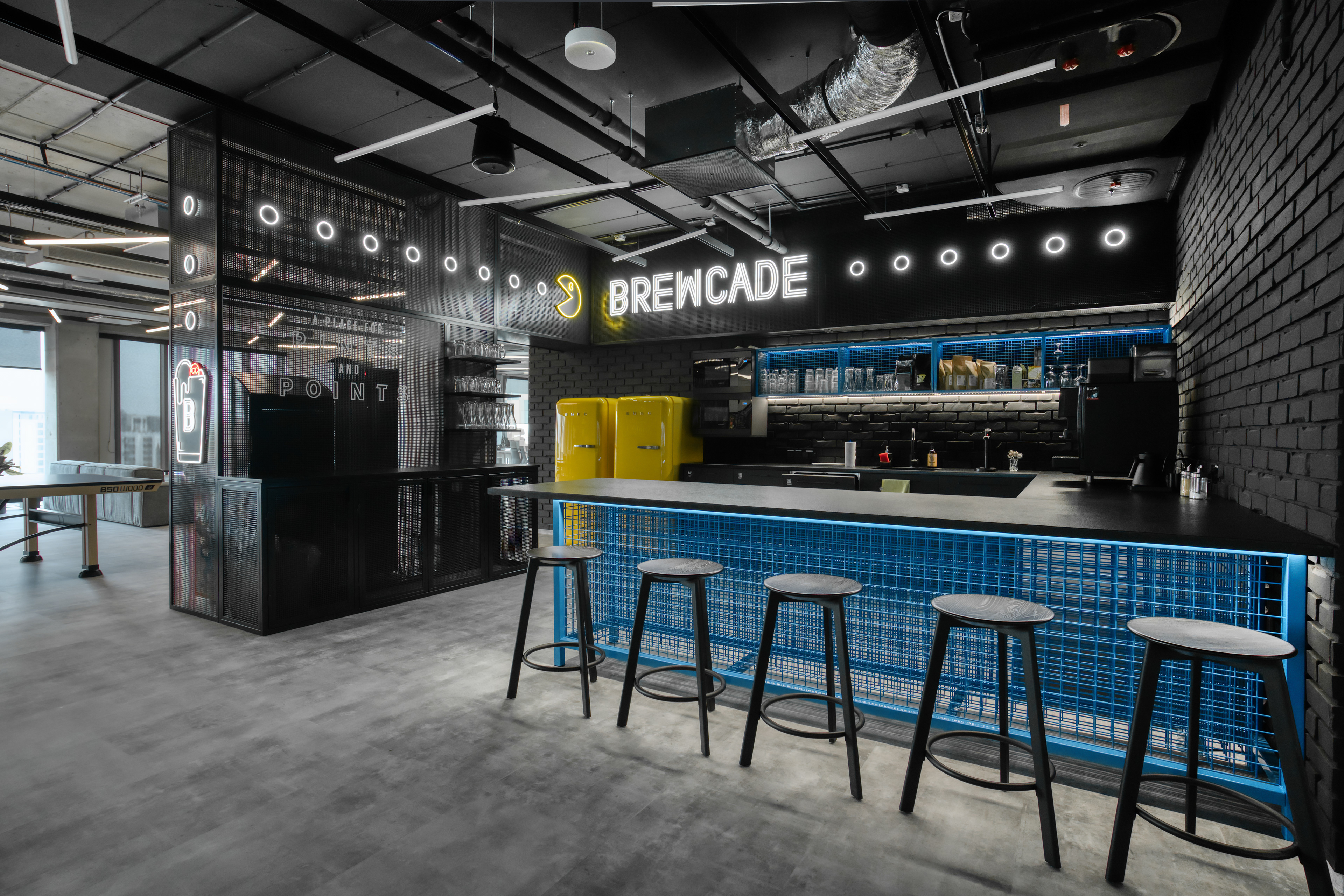
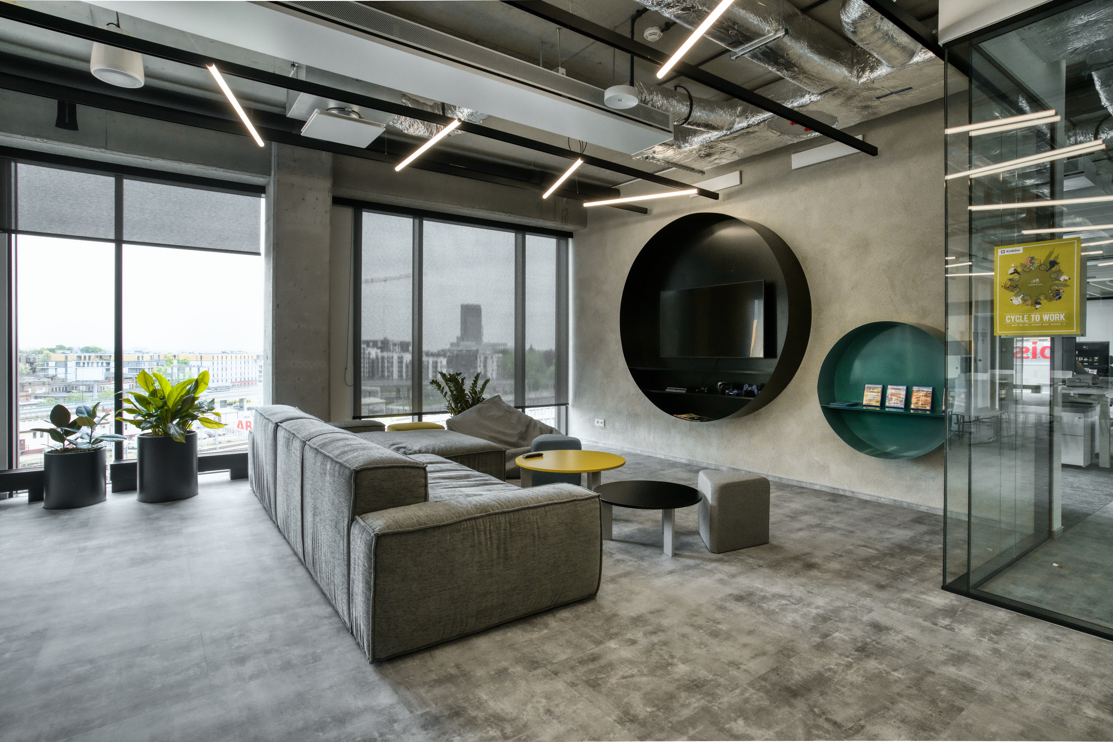
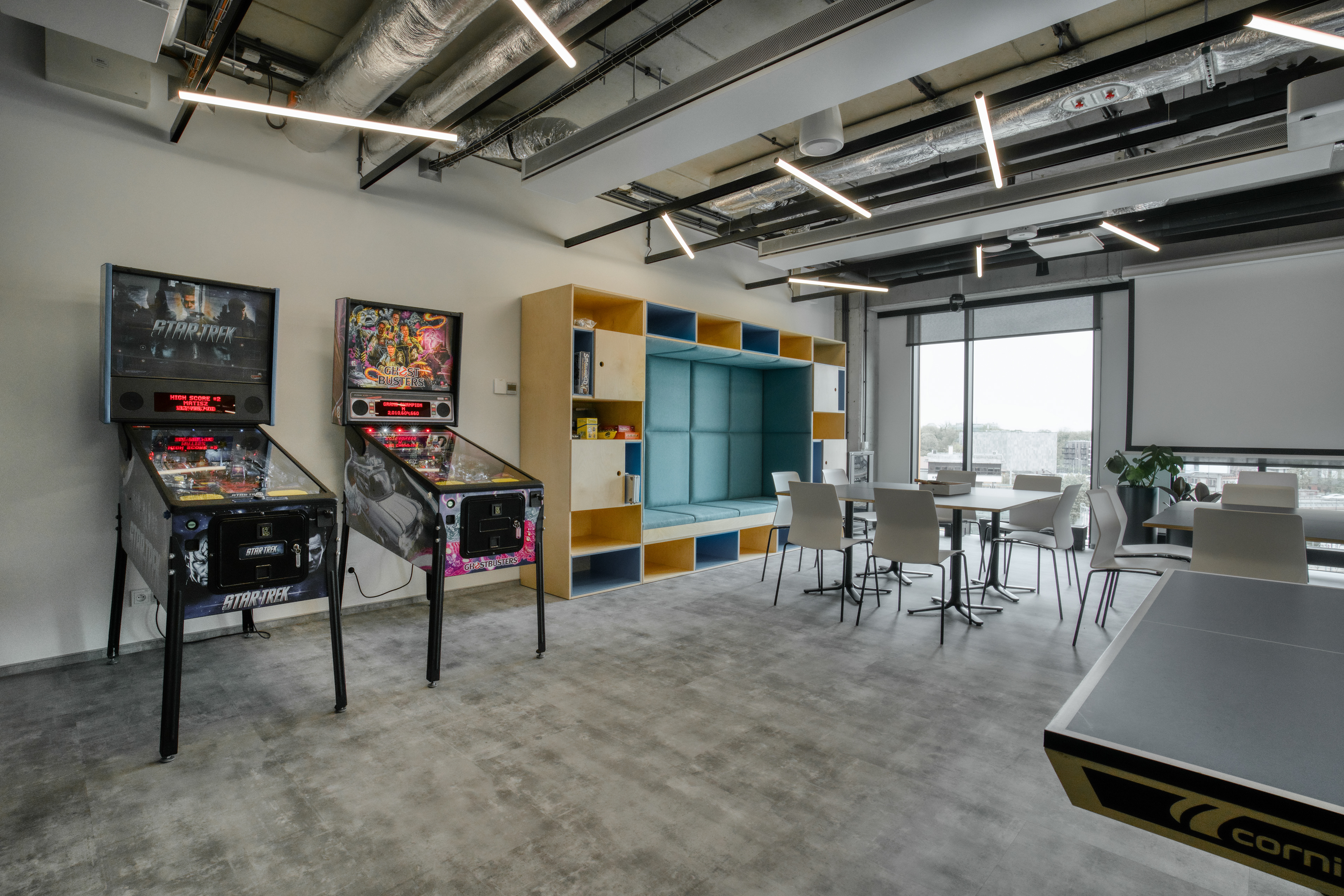
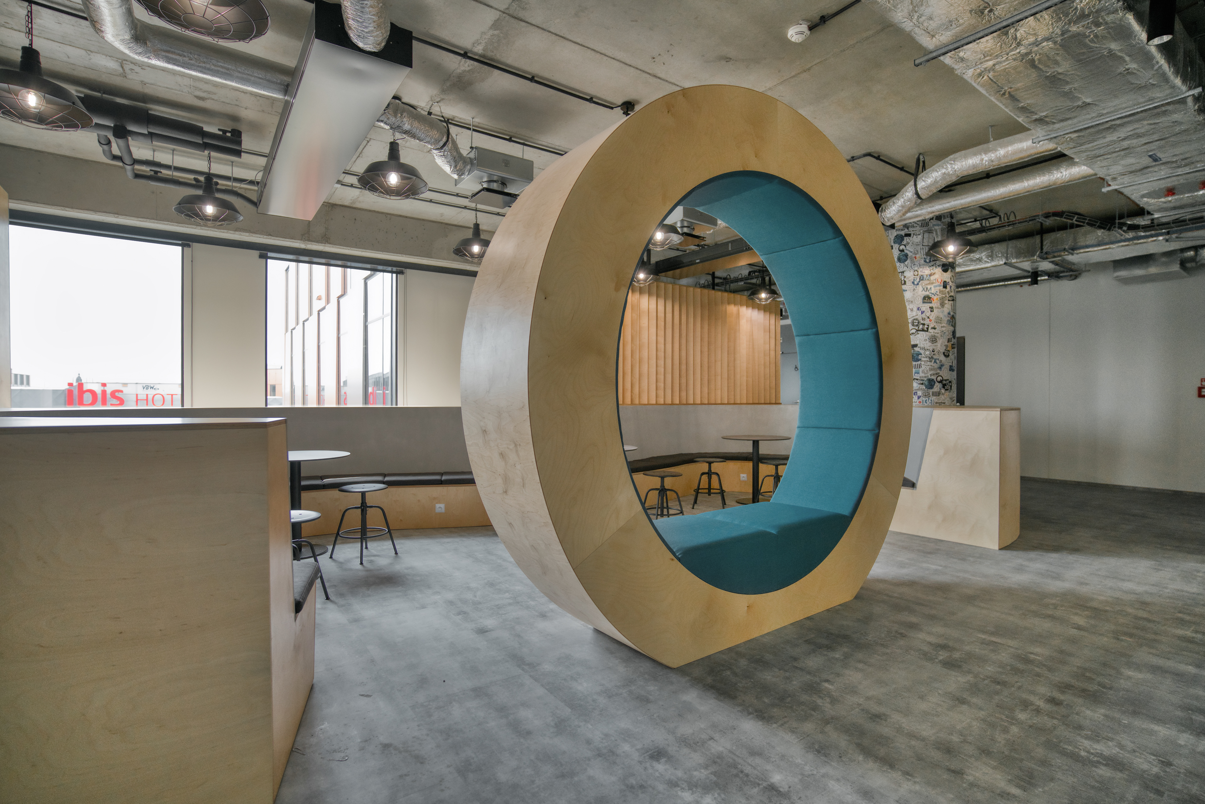
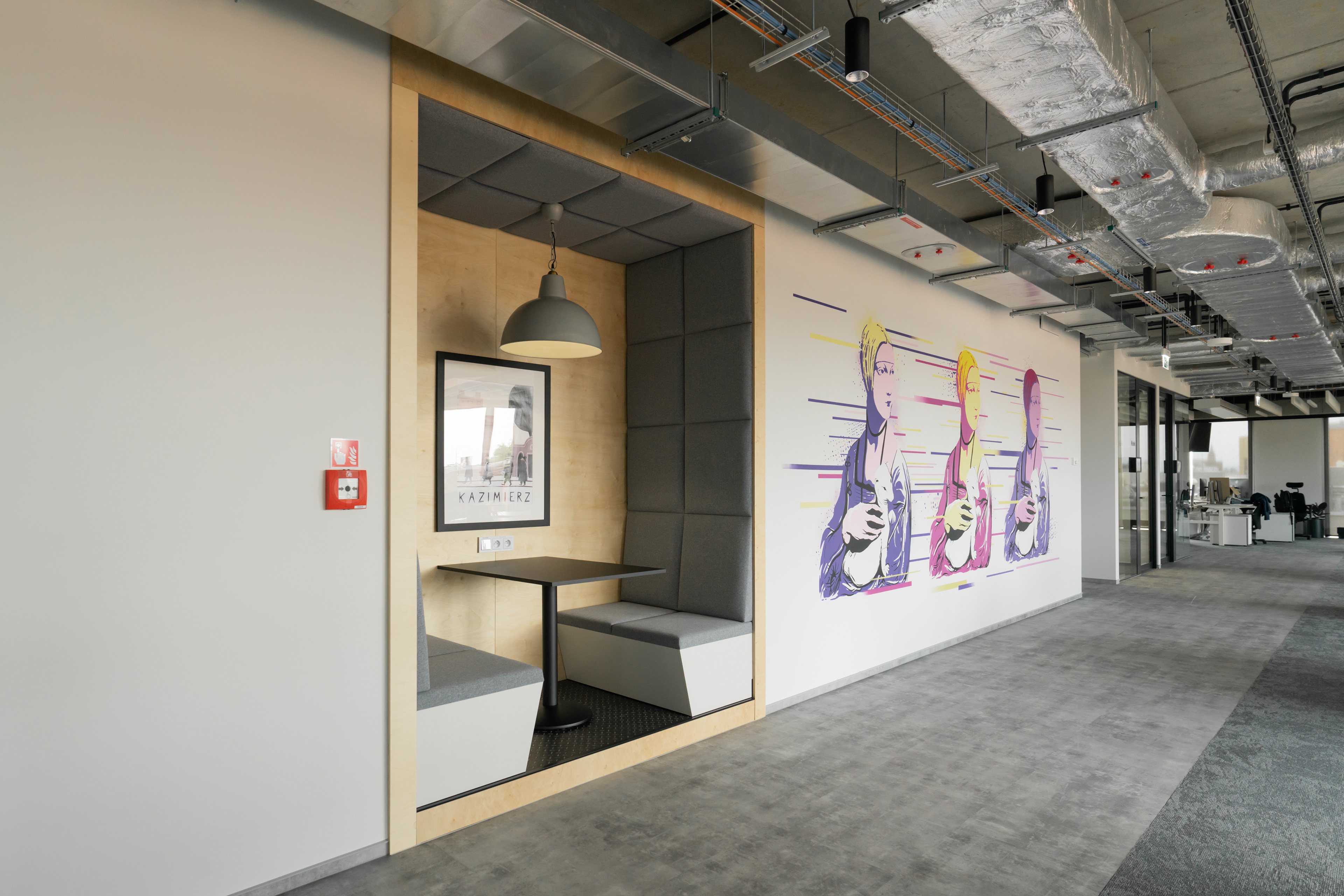
Krakow office photos
Outcomes
The campaign launched successfully in print and digital formats. The locker installations drew attention at train stations, reinforcing employer branding in a way commuters could see and relate to. The use of vibrant palettes with striking monochrome photography created visual contrast that stood out in transit environments. The client was very pleased, which led to follow-on work—social media materials followed, strengthening ongoing collaboration. Internally, the project expanded my skills in adapting designs to unusual physical dimensions and clarified how to manage vendor relationships with strict production specs.
Initial locker design mockups
Photos of lockers post campaign launch
Post campaign social media designs
Next Steps & Insights
Working under vendor constraints taught me how critical early alignment on format and layout is—knowing physical limitations up front saves time. I learned that bold color + high contrast photography can compensate for limited color fidelity when needed. For future projects I’d build mockups for all physical formats earlier in the process to avoid rework. Also to explore motion or interactive elements (animated lockers, scrollers) that could bring outdoor print to life online. Finally, creating documentation for the brand transitions (color use, photography style) helps maintain consistency when the brand identity is in flux.