
Challenge
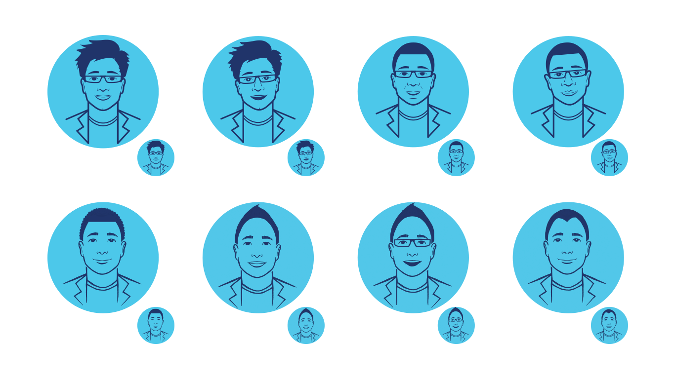
MassMutual wanted to add a chatbot to their website and contracted creative work for its illustration. They weren’t after the typical robot-look. They asked for a human character first, with detail down to age, race, glasses or no glasses. But the designs lost crucial detail at smaller sizes, so readability soon became the big risk.
Approach
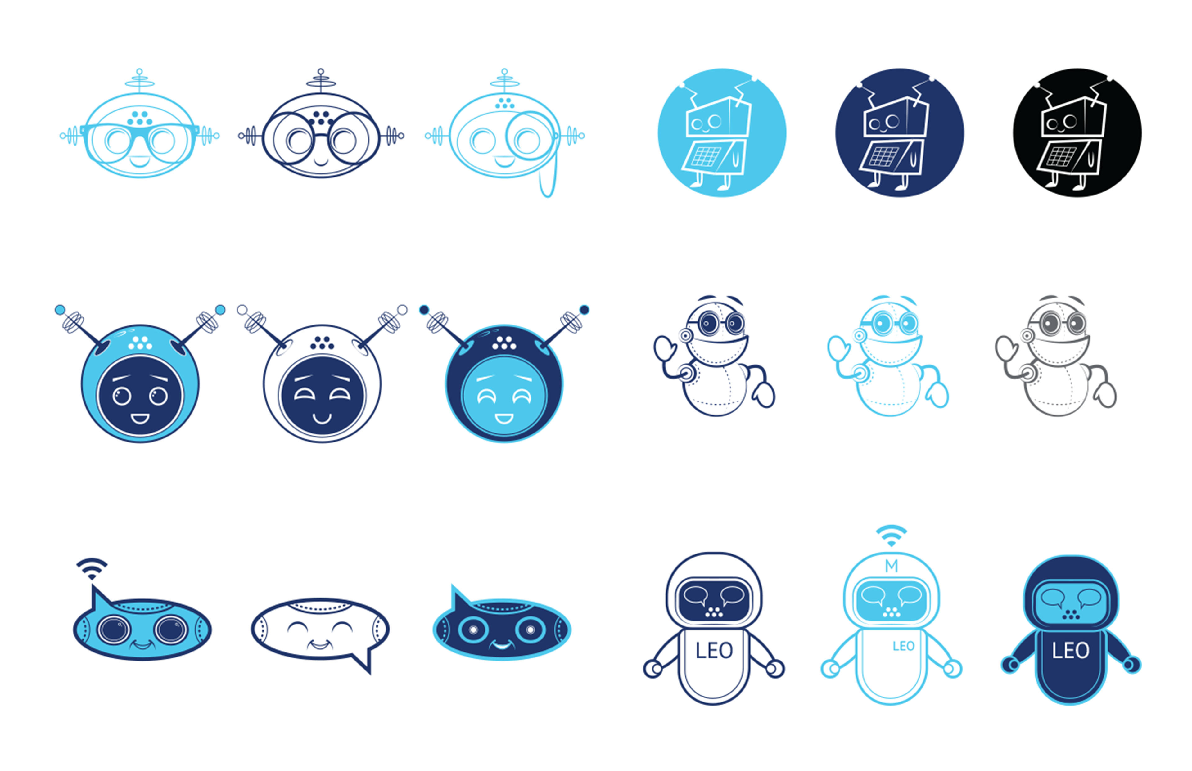
I started sketching many human character options based on early conversations, refining through feedback until six stood out. Once scaled to vectors using the brand’s blue and white palette, it became clear that too much detail hurt clarity. The human direction was dropped. Then I researched various chatbot visuals in the market and experimented with shapes, talking bubbles, Wi-Fi signals, and parts of MassMutual’s tertiary logo. The goal: figure out a friendly bot that reads well at all sizes and feels both usable and branded.
Initial sketches

Execution
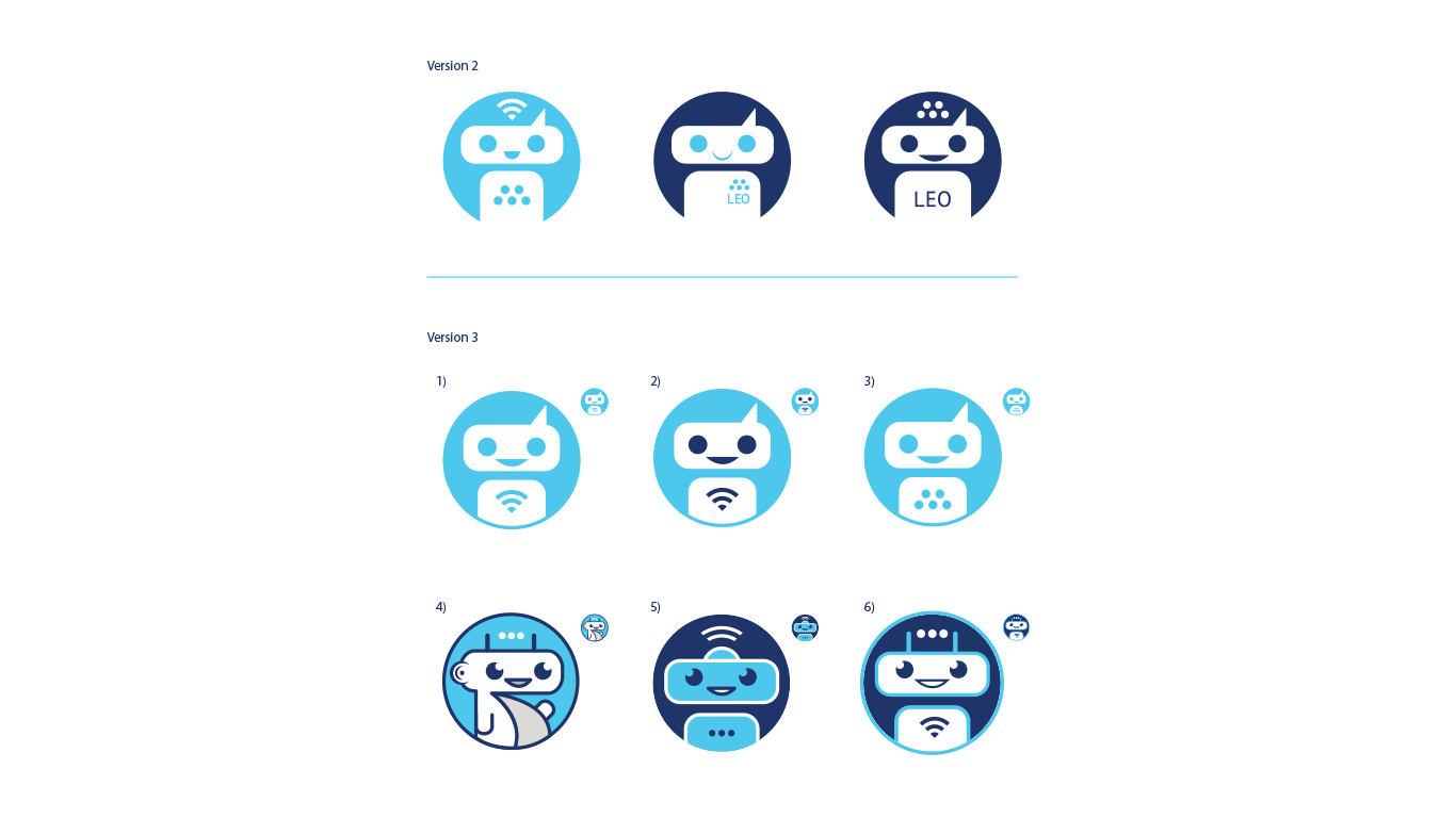
I reduced complexity, leaning into simple shapes and strong color contrast to ensure the design works small and large. I explored positive and negative space to give the bot depth and personality without relying on detail. I developed multiple versions, iterated with the client, and refined finalists. One design—simple, clean, friendly, readable—became the final choice. It retained subtle nods to the brand identity in the eyes and use of shapes inspired by the logo and communications metaphors.
First round of vector designs
Sequential rounds of vector designs

Outcomes
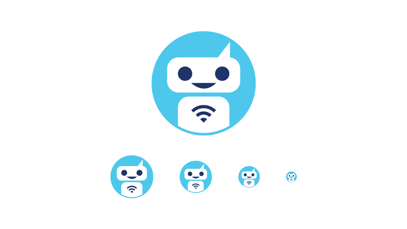
The final chatbot illustration delivered a much better balance of usability and personality. It read clearly across all devices and sizes. The client was pleased not only with how fresh and friendly the design felt but how well it solved the scalability issue. The project also reinforced trust: sometimes stripping back complexity enhances clarity and impact.
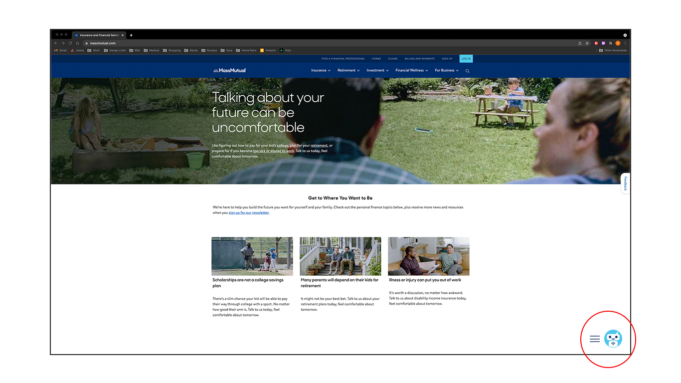
Final live design incorporated into site
Next Steps & Insights
I learned how critical early prototype testing at small scale is, especially for icons or illustrations used in multiple sizes. Less detail often lets the core idea shine. I also saw how useful it is to capture client feedback on both personality and readability. For future bot or icon work, I’d build more simplified concepts early, test across device sizes first, and experiment with motion or interaction so the bot can animate or respond subtly.