Challenge
At BrownFlynn, I was asked to lead the design of a sustainability report for IDT, a company producing synthetic DNA for life sciences. The brief was complex: lots of data, scientific content, sensitive topics, and a need to make it readable and compelling for both technical and non-technical audiences. We also had to respect strict brand standards while creating something stylish, editorial, and polished.
Approach
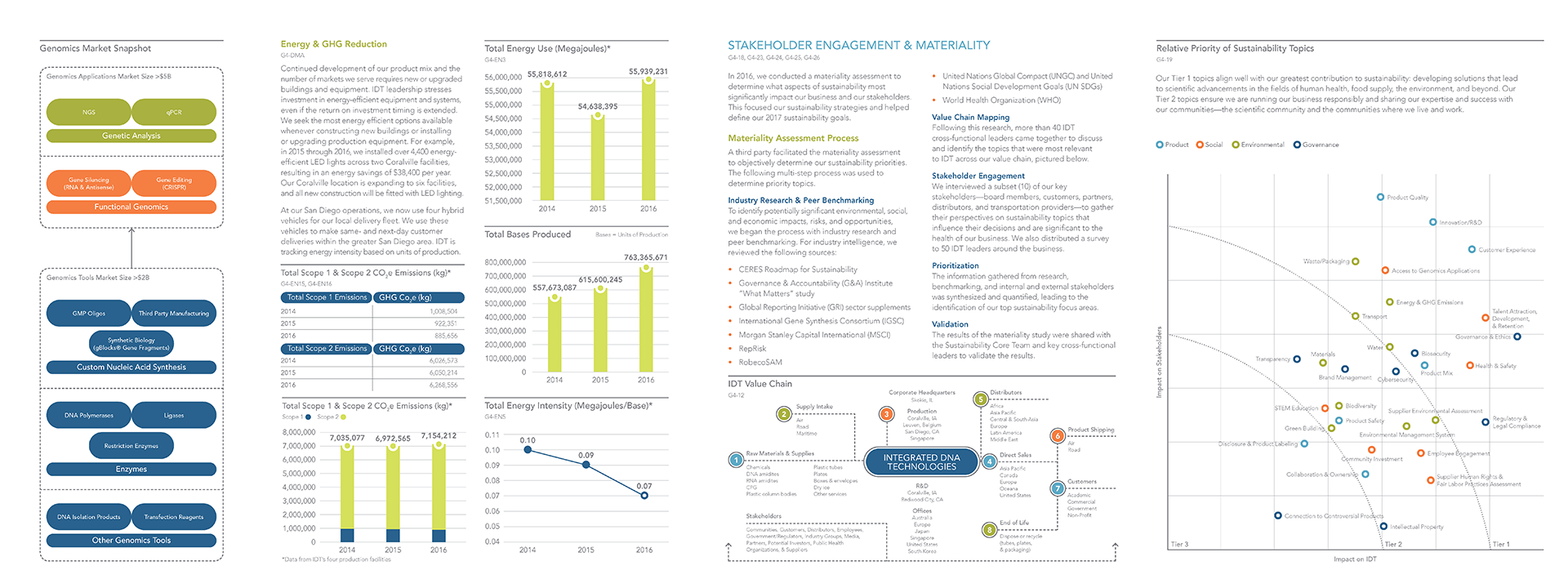
I started with deep research into scientists’ communication styles and sustainability-reporting norms. Analysts and I gathered data, charted out the most technical content, and asked the tough questions: what do people actually want out of a sustainability report? I sketched infographics and photography treatments inspired by DNA strands and scientific imagery to help clarify complex ideas. I developed a few strong concept directions and presented three to the client so we could align early on tone and visual direction.

Execution
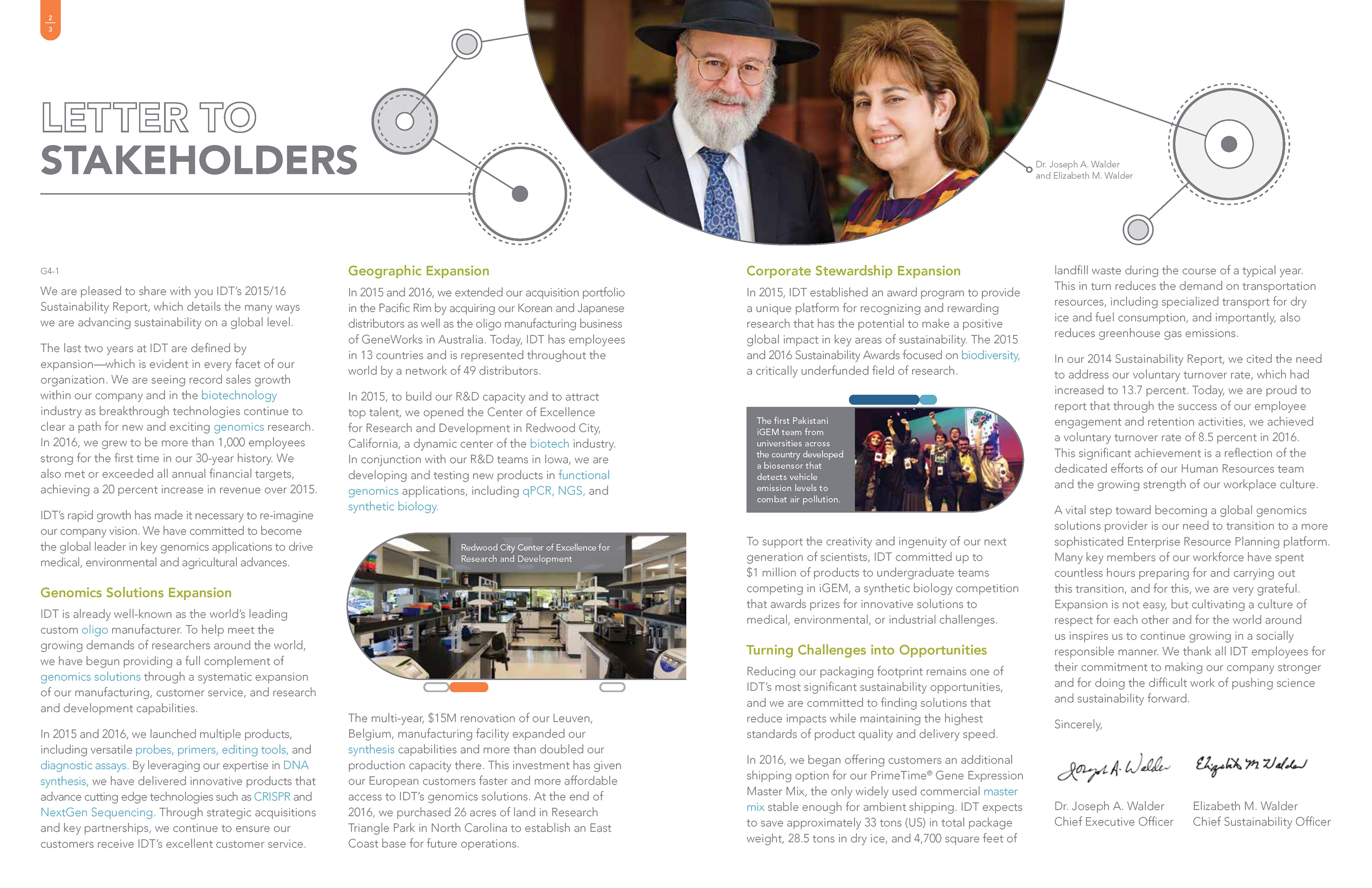
Once a design direction was chosen, I built custom data visualizations, charts, tables, and spreads that broke down scientific content into digestible sections. I created photography treatments that tied back to the DNA theme and used editorial layouts to give breathing room to content. Working closely with analysts, I ensured every figure and table was double-checked for accuracy. Because the content was dense, it was important to manage white space and hierarchy so the reader didn’t feel overwhelmed. I also made design choices that supported print production and ensured that the magazine-like layout survived technical constraints.
Outcomes
The final report was very well received by both IDT and internal stakeholders at BrownFlynn. It stood out visually among other sustainability reports thanks to its clarity, creativity, and editorial polish. Feedback praised how the complex content felt approachable and how the design elevated the readability of stiff scientific figures. Internally, the work strengthened my ability to translate dense data into stories that feel human and accessible while maintaining scientific rigour and brand integrity.
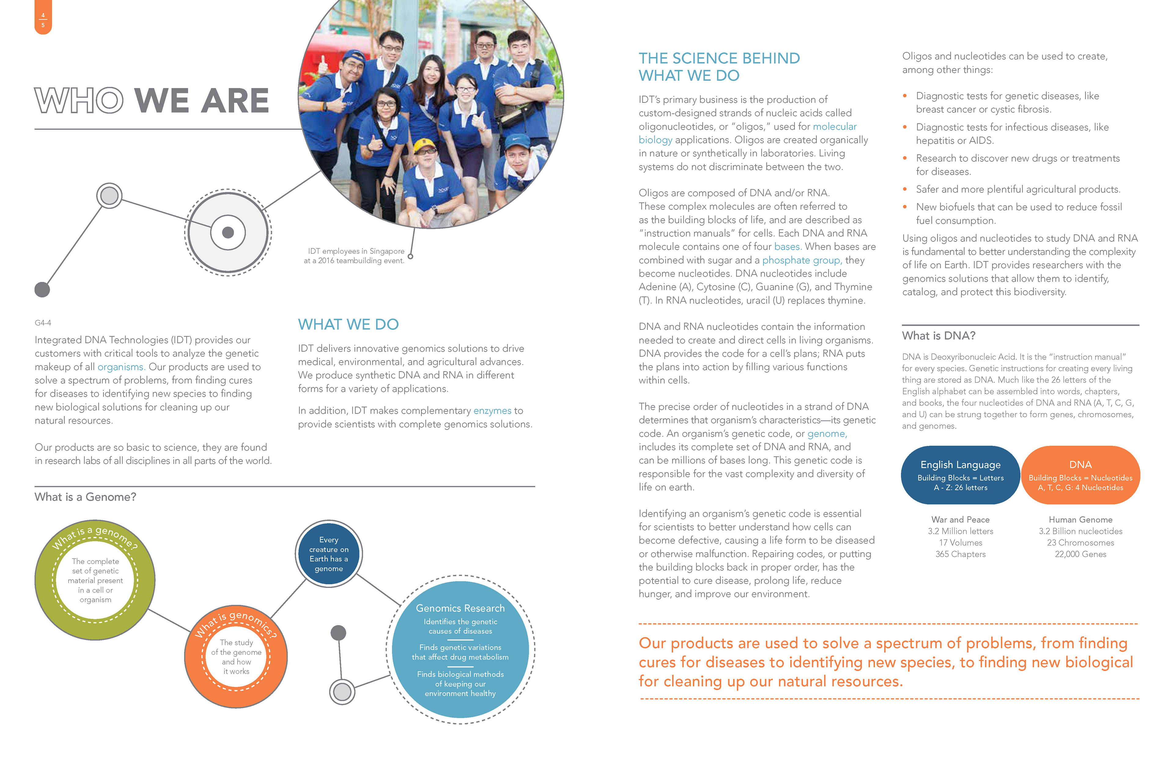
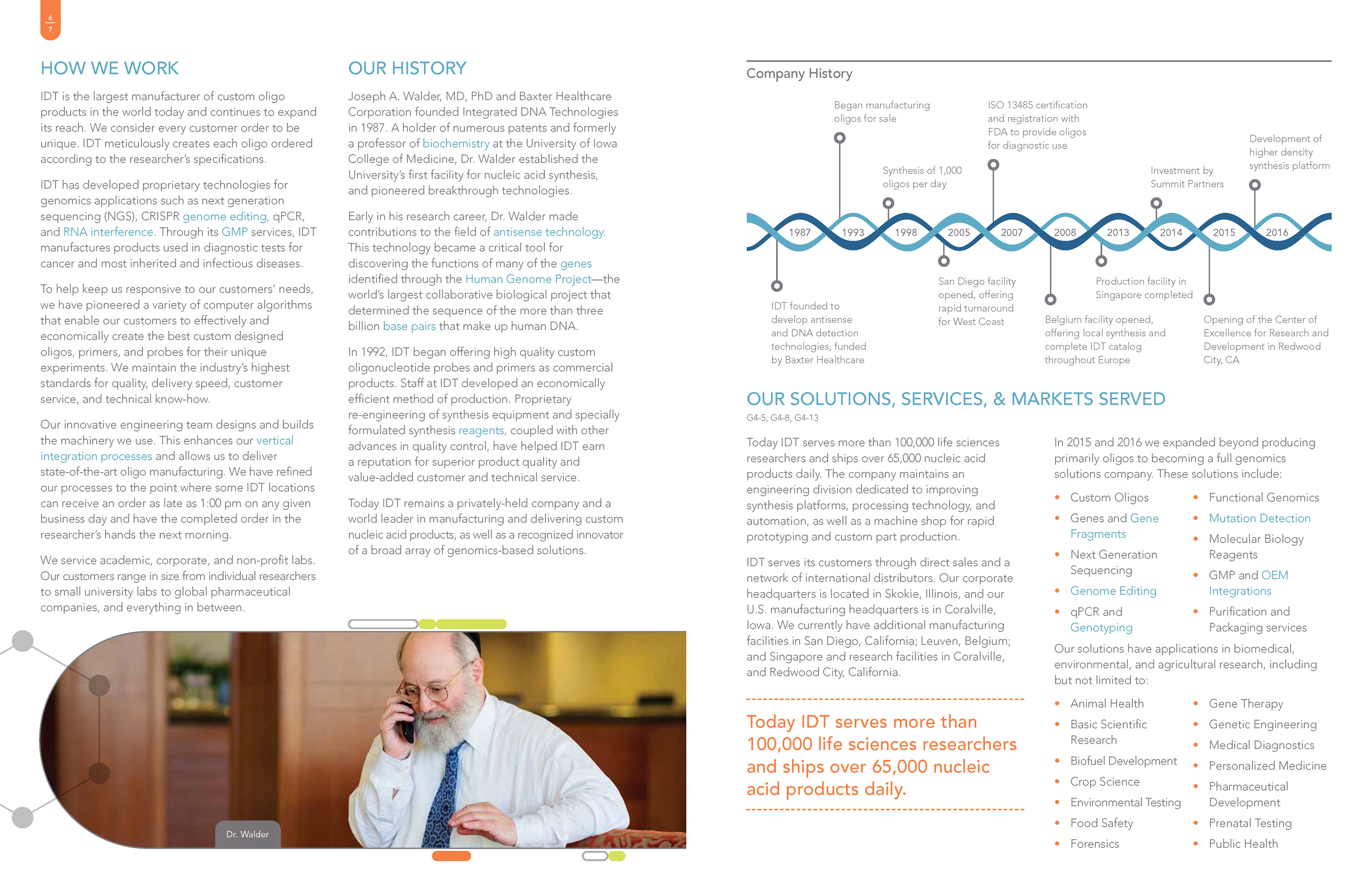
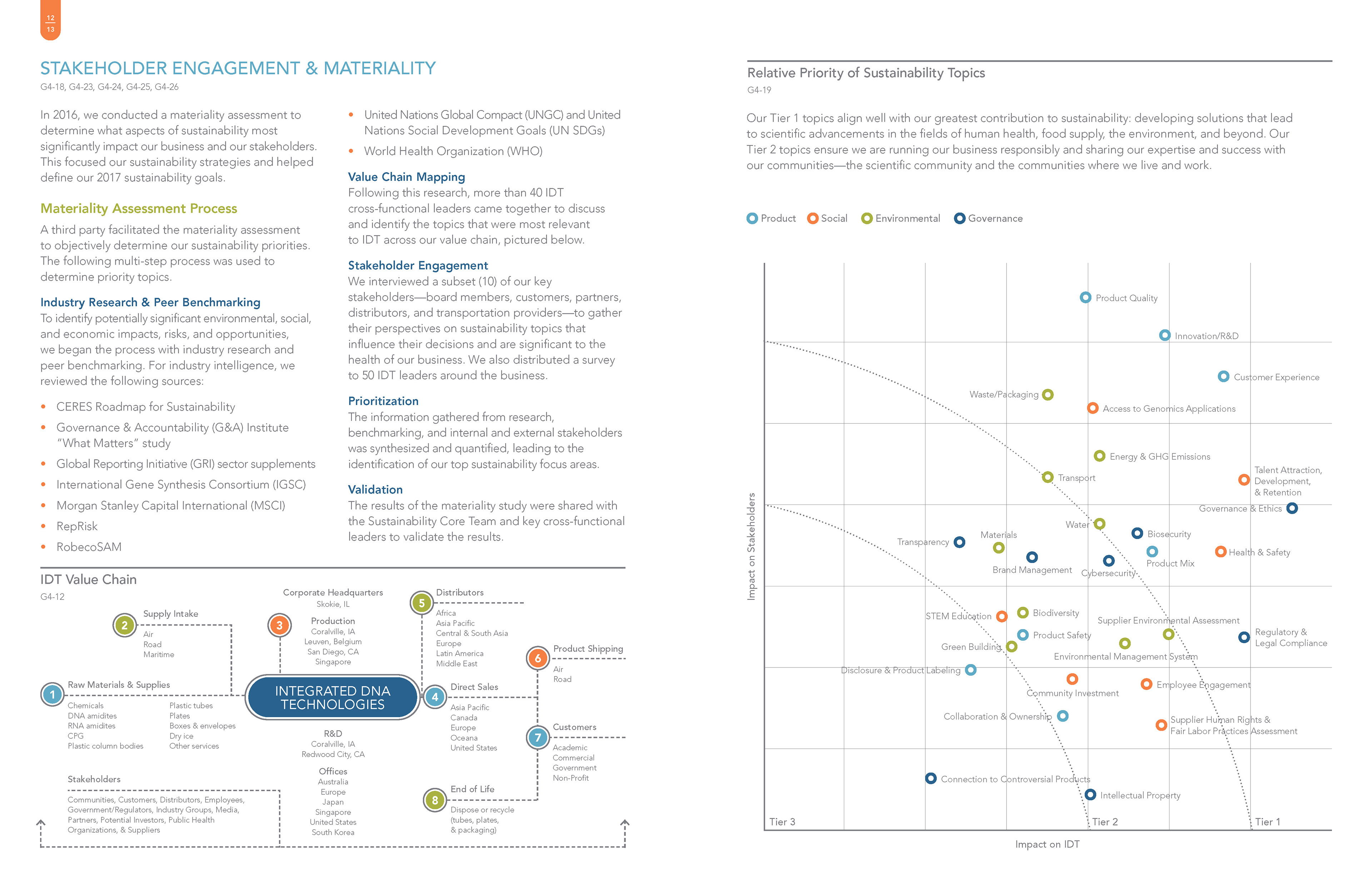
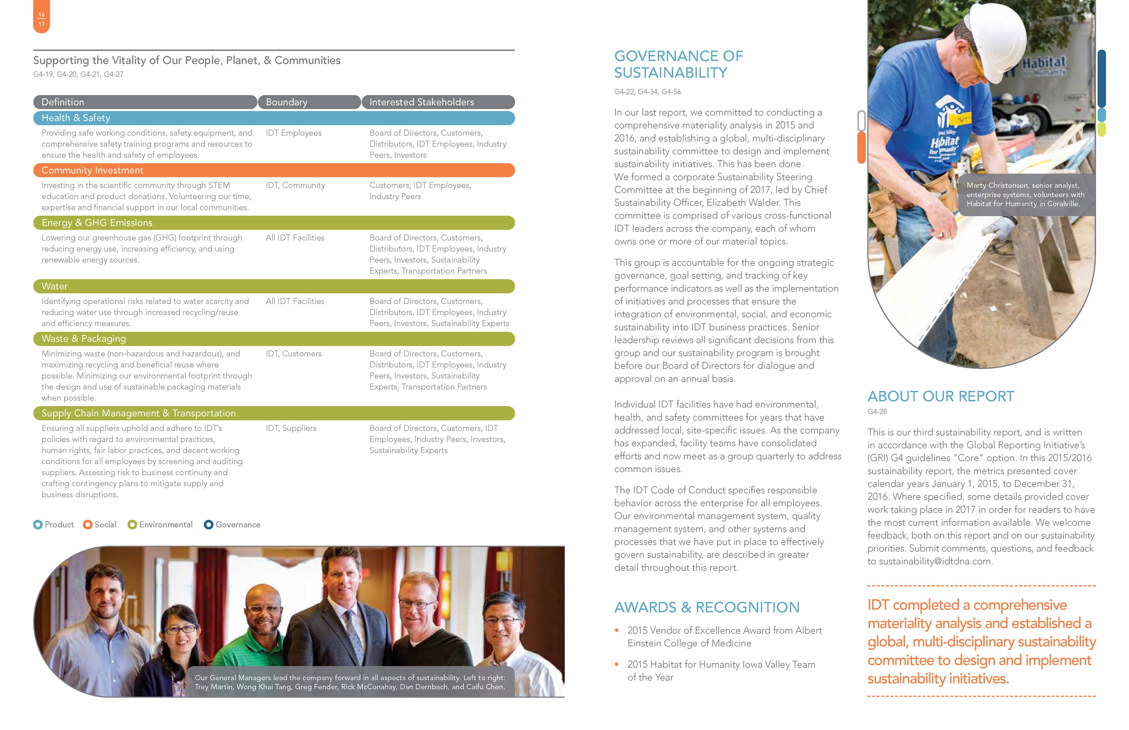
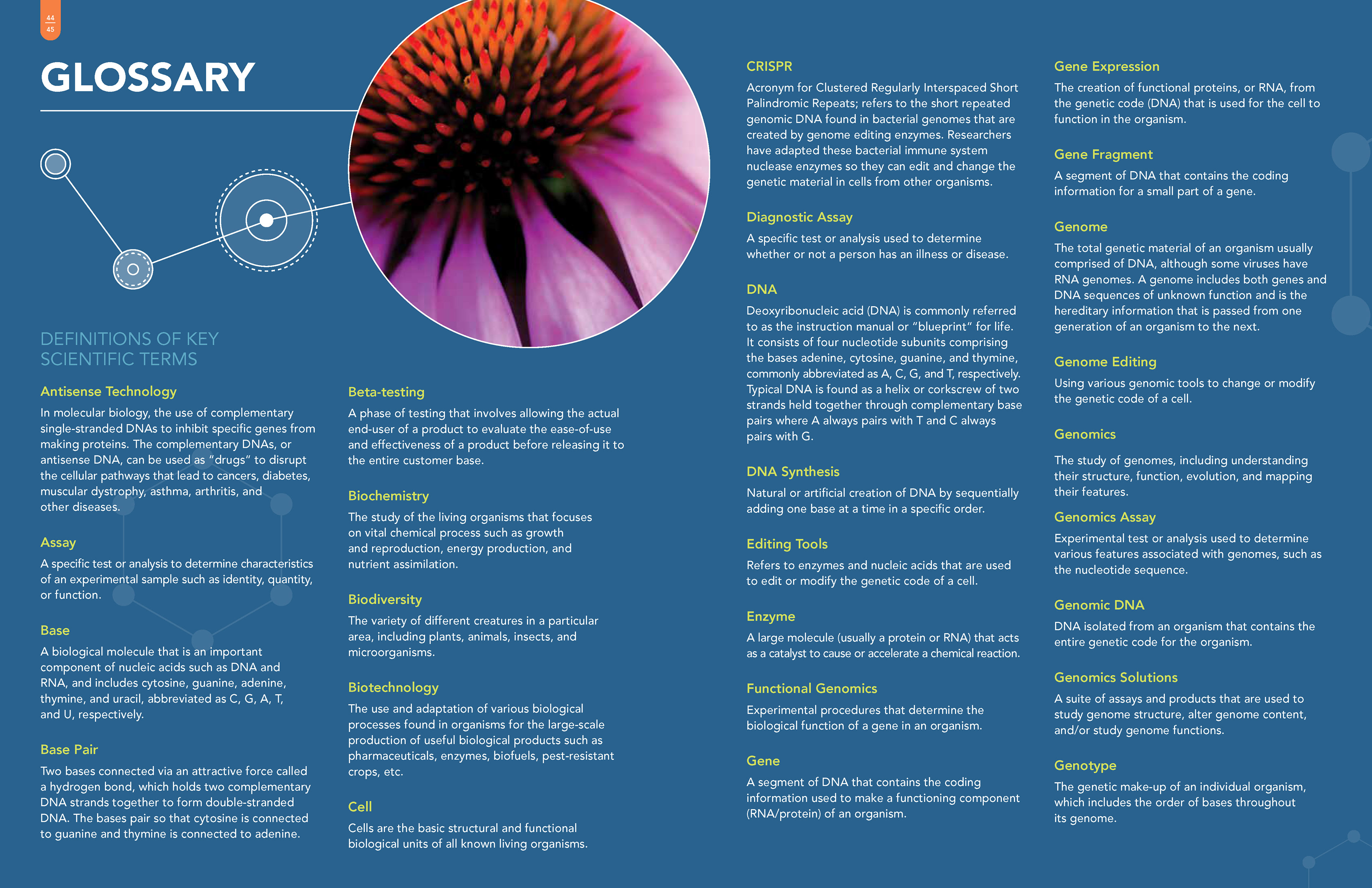
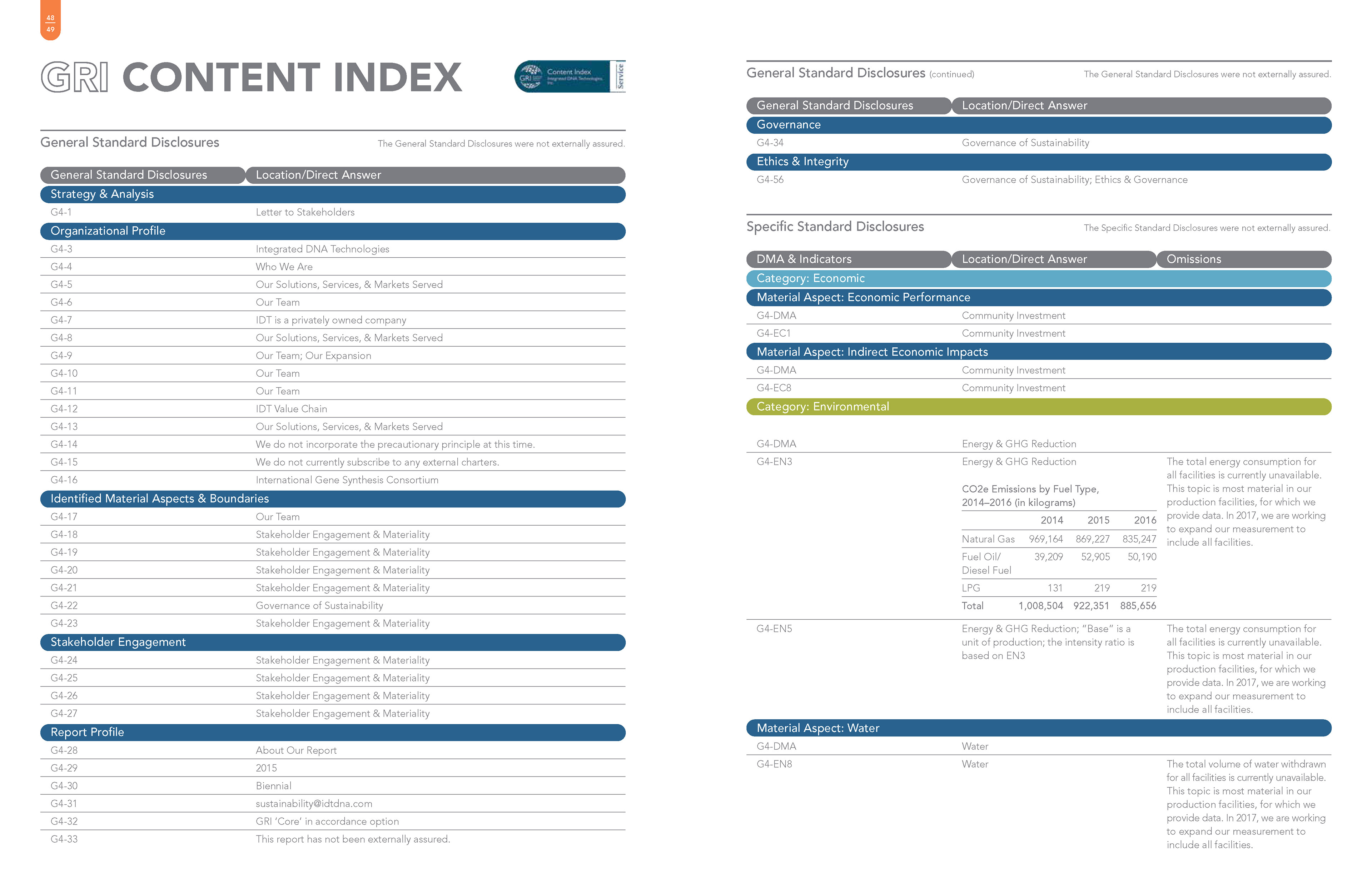
Final print ready layouts


Next Steps & Insights
Working on IDT reinforced that for data-heavy content, simplicity in visual storytelling is essential. Custom infographics and clear hierarchy matters more than decorative detail when measured against clarity. I learned how much early alignment with analysts can save time and revisions. For future reports I’d build templates that allow content to change without breaking layout, include interactive digital versions so readers can explore data, and experiment with motion or animation to bring scientific visuals to life in digital formats.