
Challenge
A few years ago I joined a global distributor of transmission and driveline parts that had expanded into full-service parts for auto repair shops. They had nearly a dozen sub-brands, each with different visual styles, old ads, outdated assets, and a confusing brand ecosystem. The company needed consistency, modernity, and visual clarity in a space that’s rugged and technical.
Approach
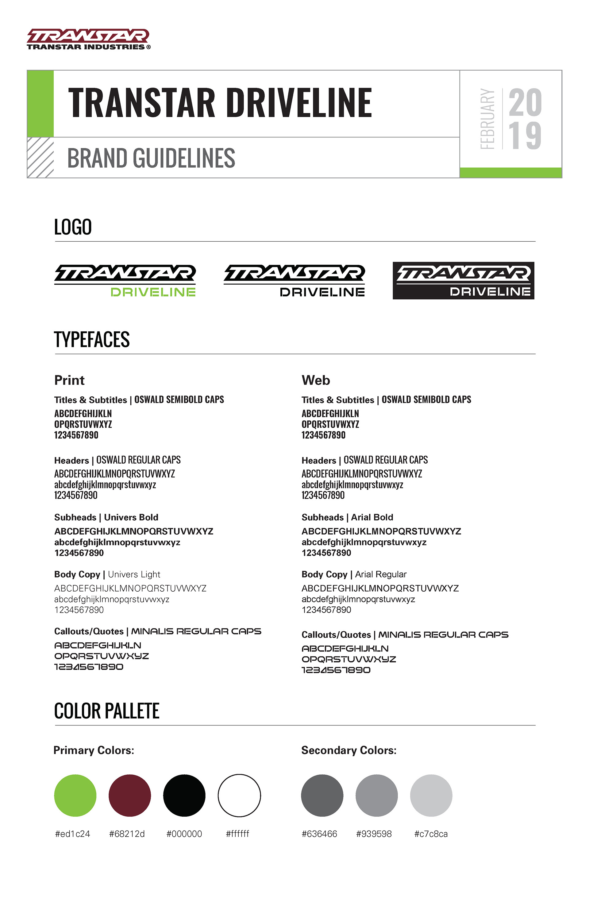
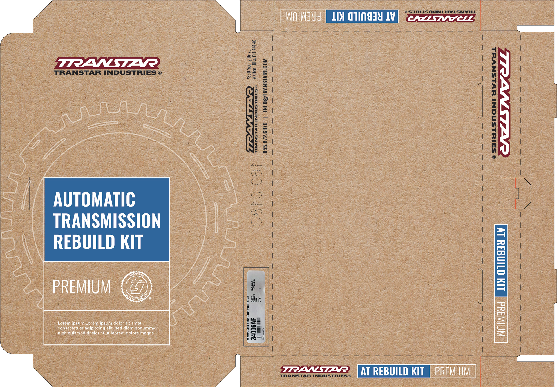
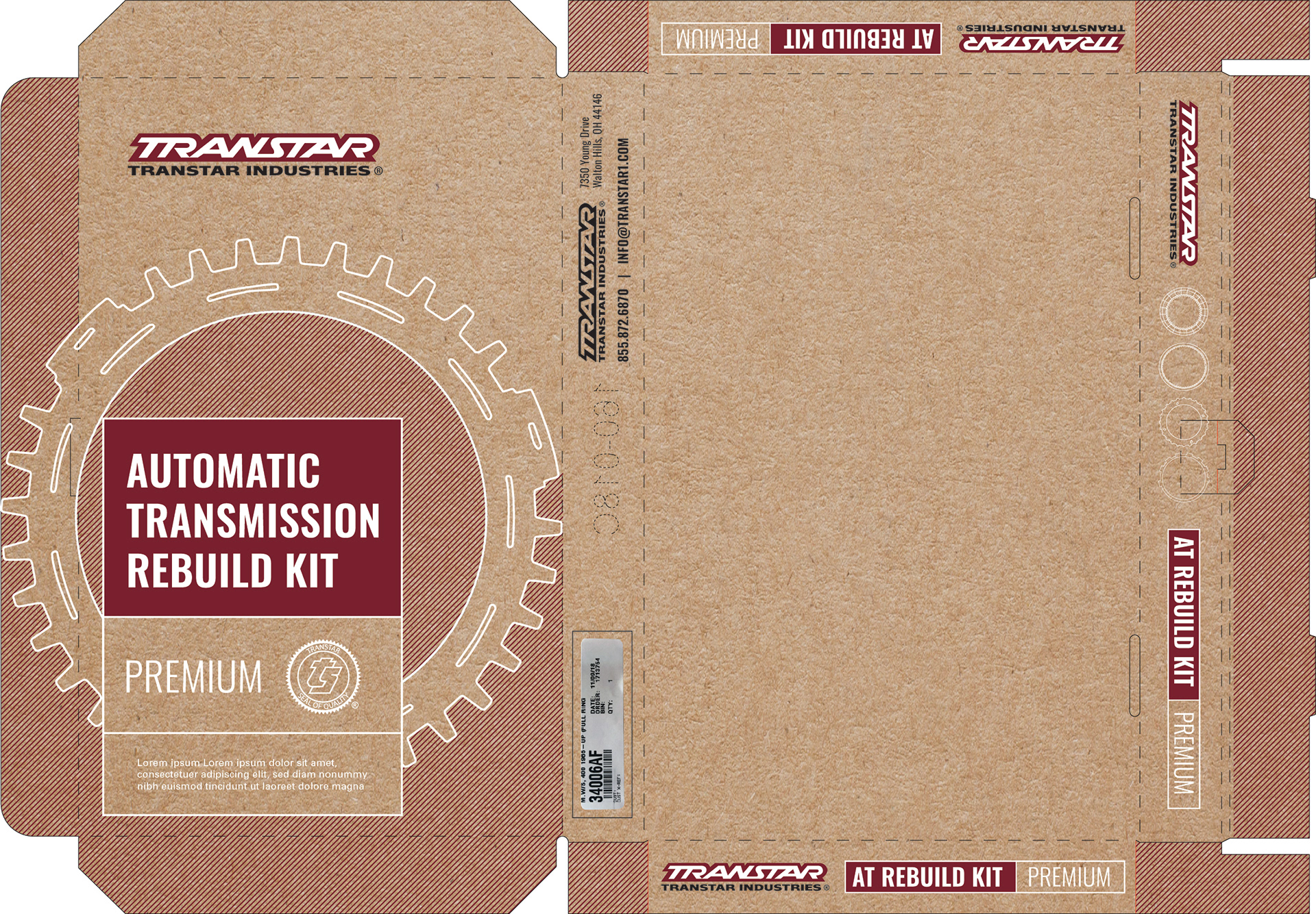
I dove in with research—studying competitors, understanding transmission components, packaging norms, trade publications, and the expectations of mechanics and shop owners. I built foundational branding guides for each sub-brand—color palettes, typography, tone—so that every visual voice could be distinct while still feeling part of the same family. For packaging, since budget and printing constraints were tight, I leaned on one-ink prints, texture, and layout rather than full color. I scanned real product parts to generate pattern elements that reflected the product’s complexity.
Brand Guidelines Mockups


Execution
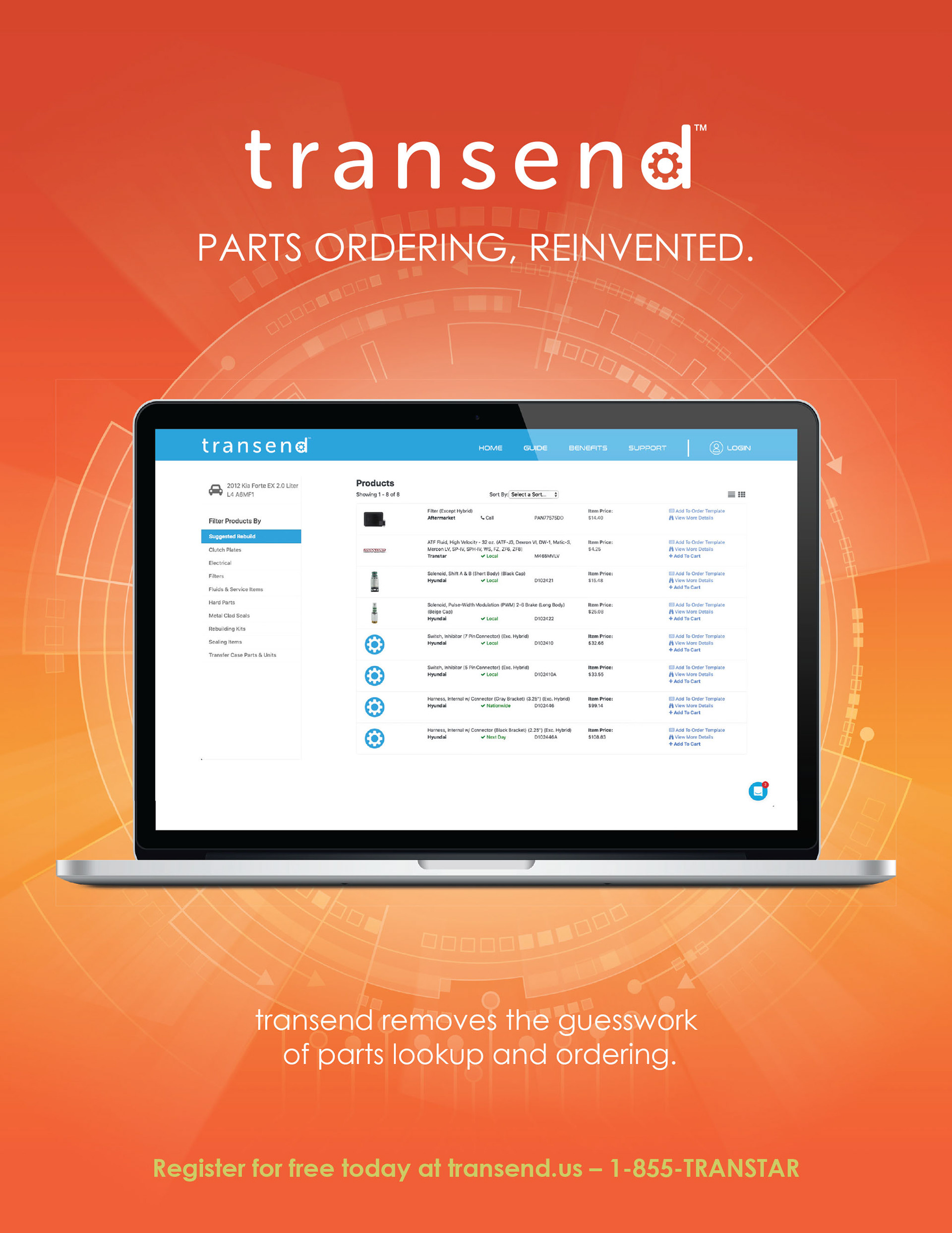
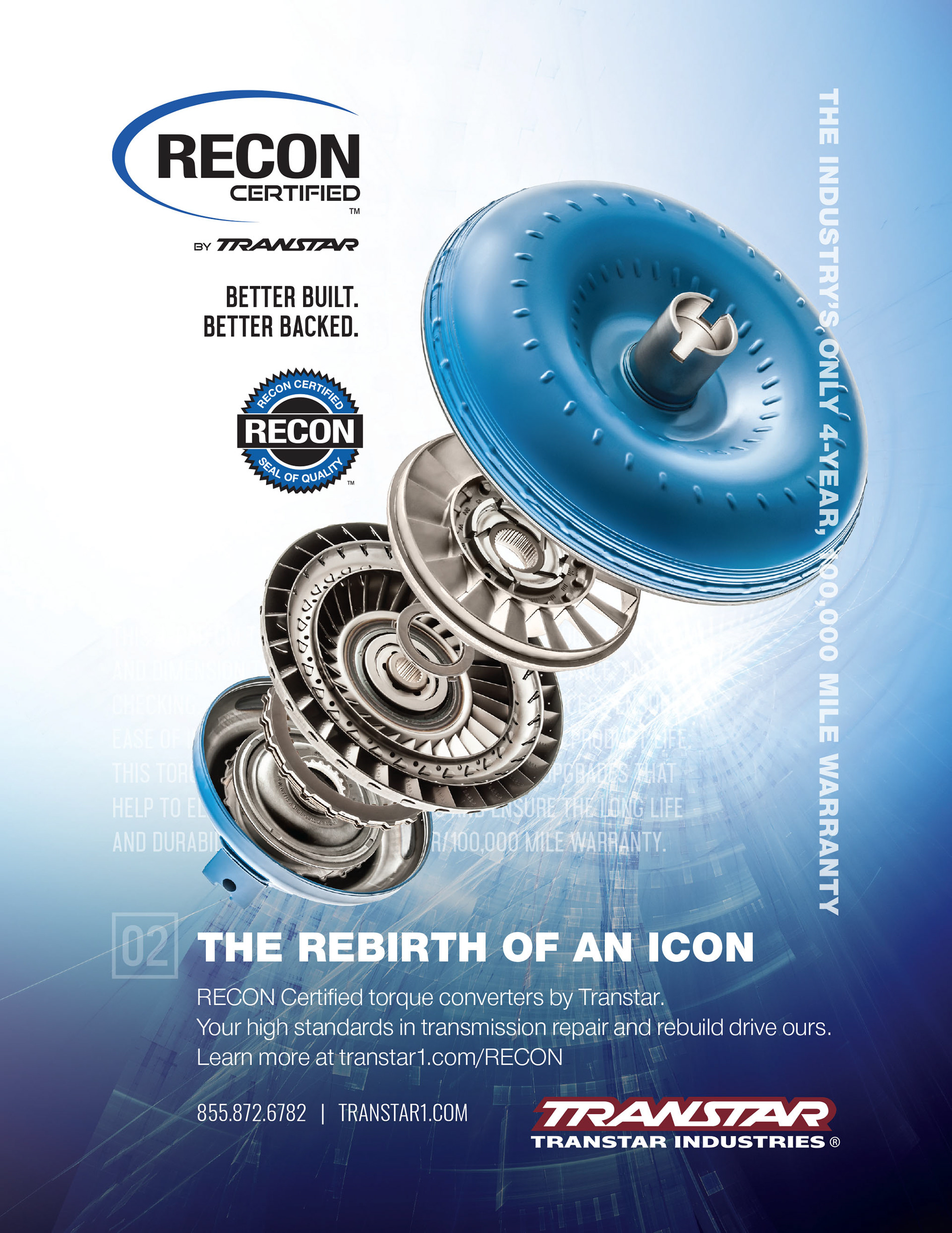
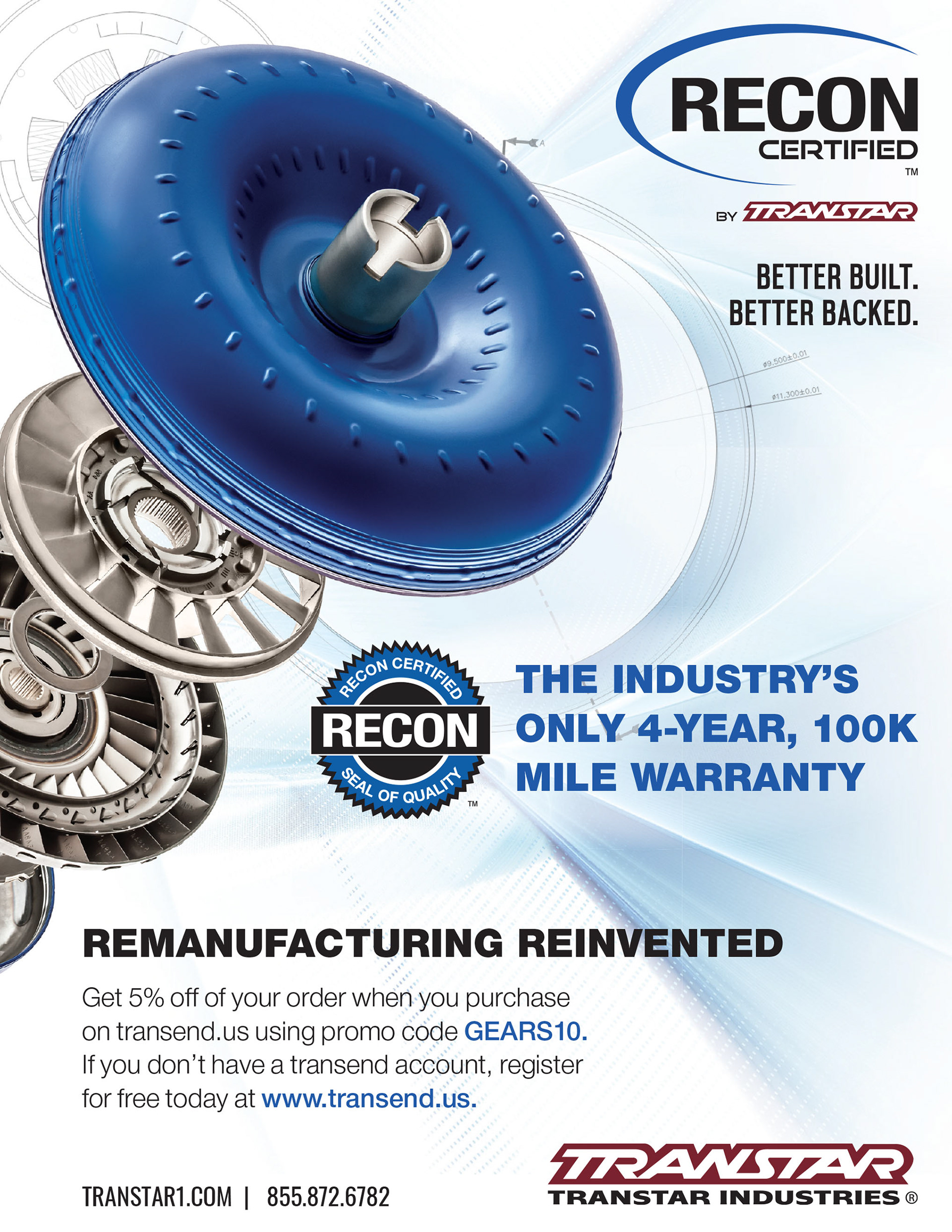
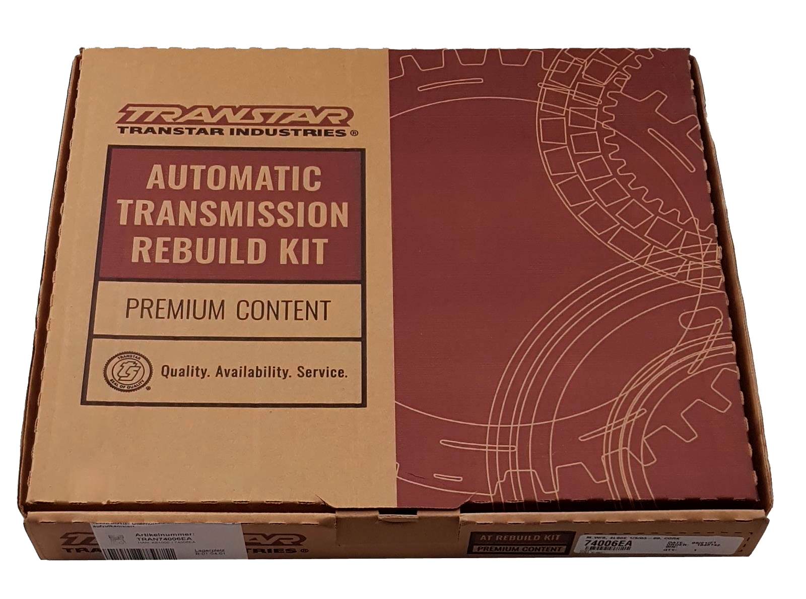
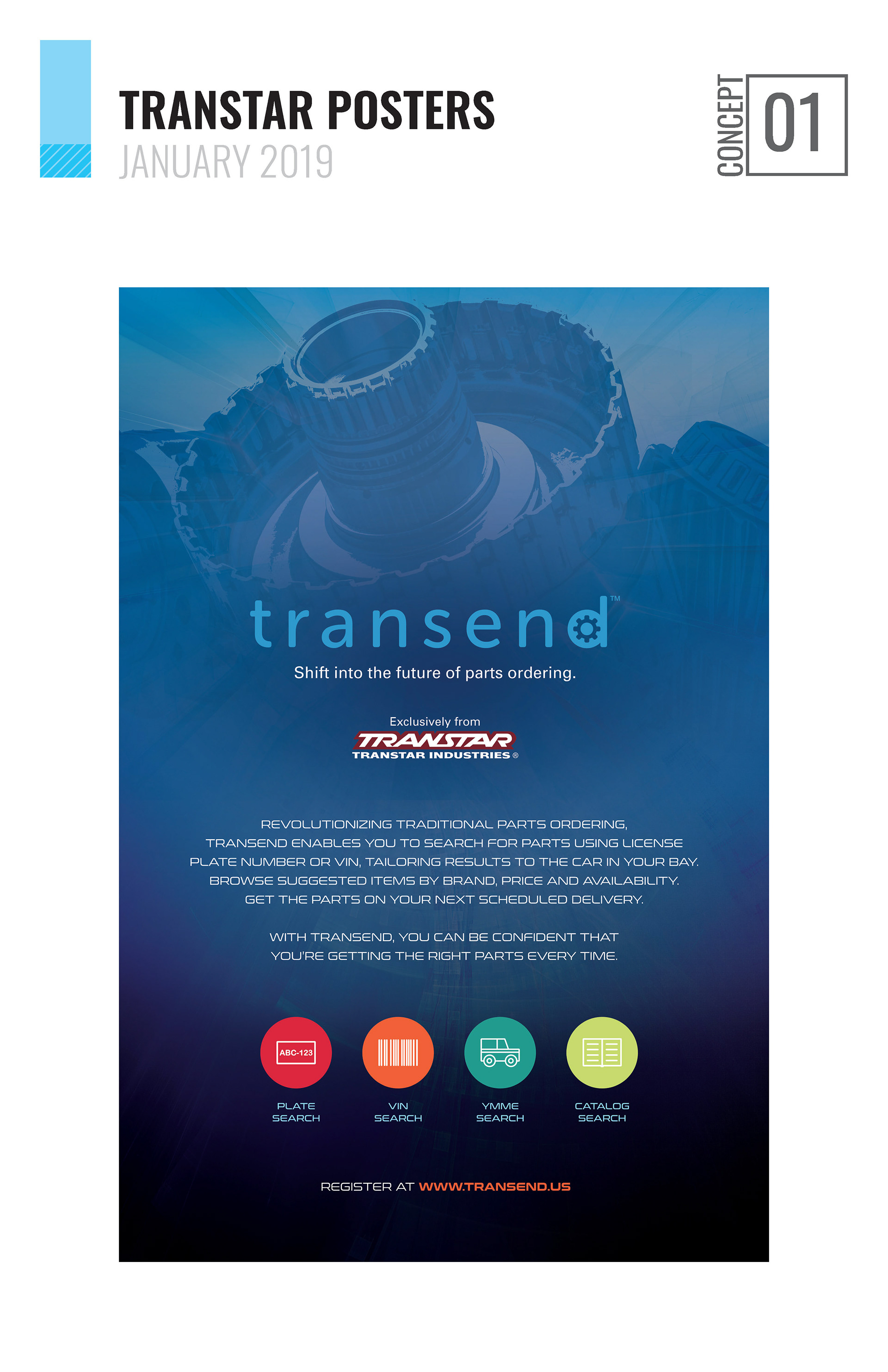
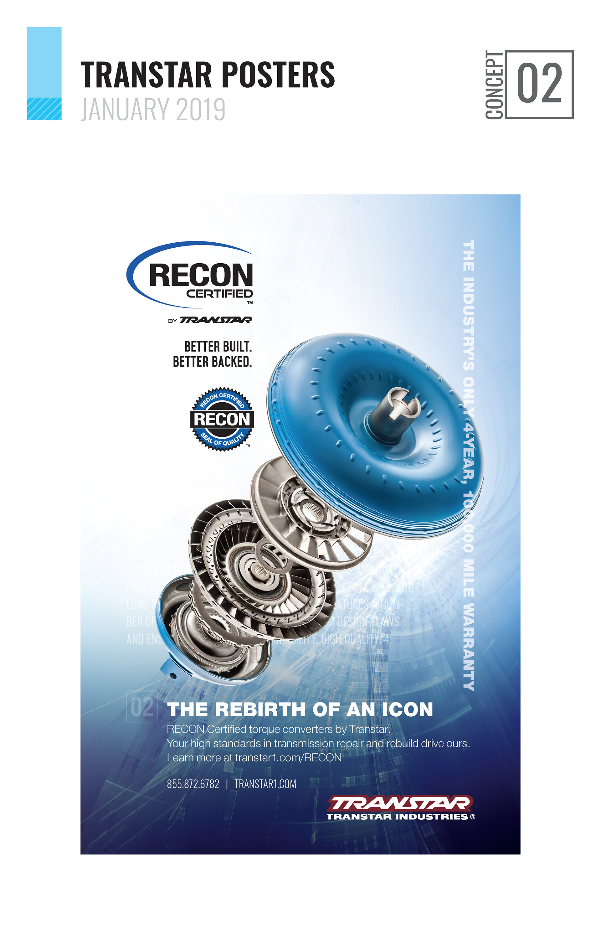
I refreshed trade publication ads with modern layouts and unified styling so they looked clean and confident. I designed lockup systems to pair each sub-brand name with the parent company logo so cohesion was clear without losing identity. I developed packaging for a rebuild kit using kraft cardboard, black ink only, minimal color accents, and leverage mechanical shapes to drive visual interest. I created merch, posters, and promotional pieces that felt elevated—more than just “swag”—so they reinforced brand credibility at industry events. I collaborated closely with vendors and internal stakeholders to ensure each design translated well in production under constraints.
Magazine Ads


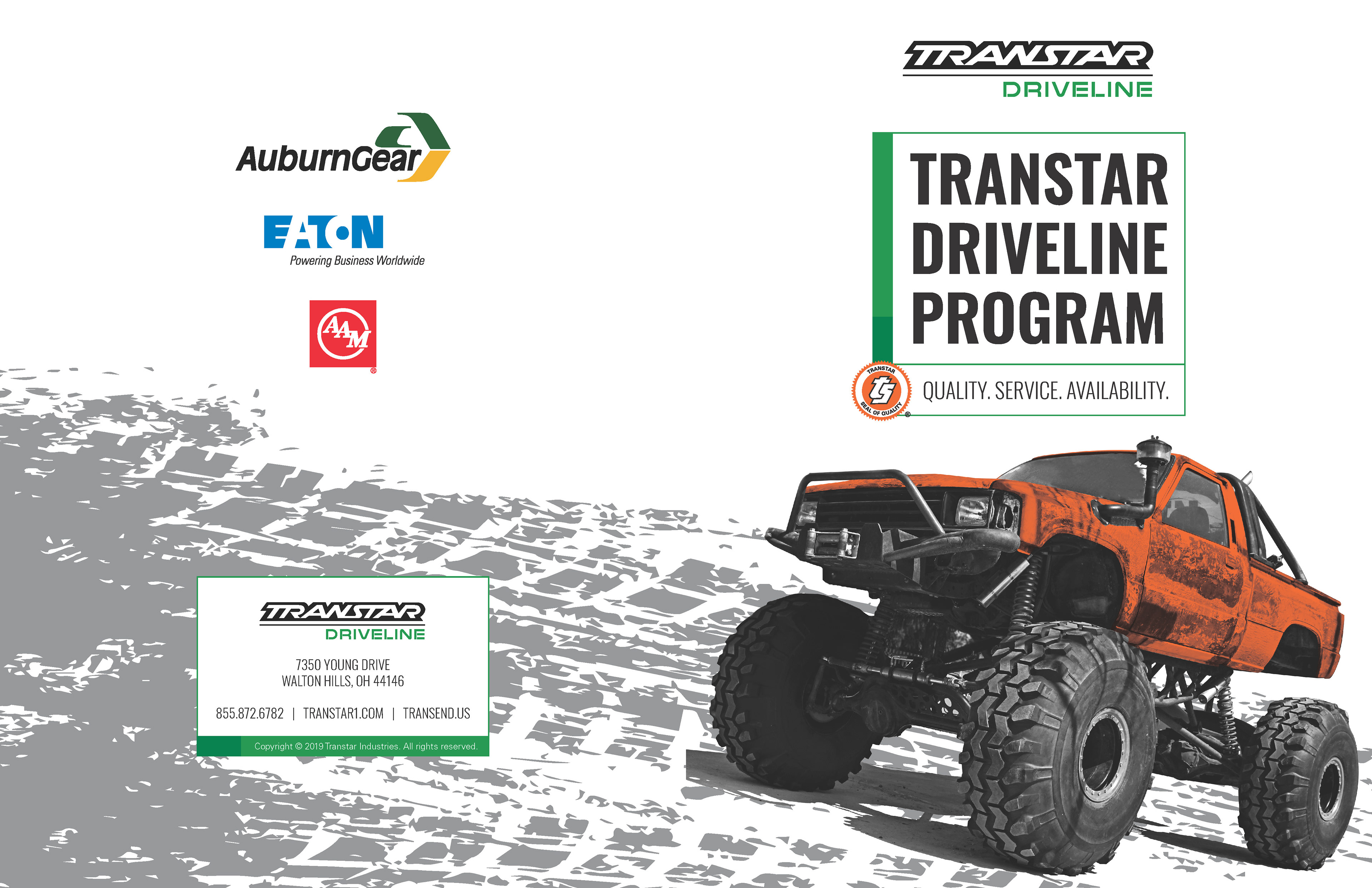
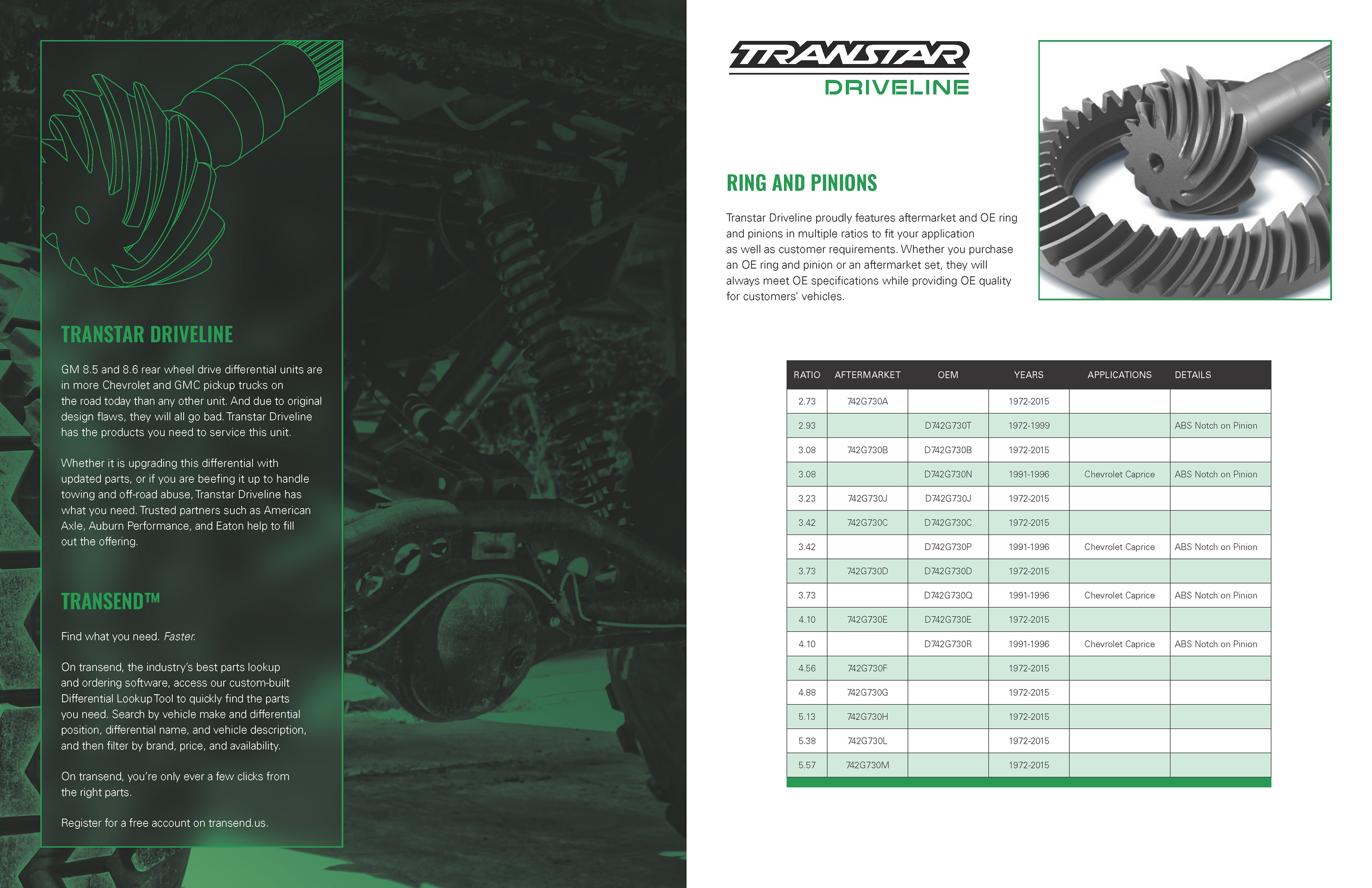
Driveline Program Sales Spec Sheet


Outcomes
The refreshed brand system brought immediate improvements in coherence and clarity. Marketing and sales materials felt modern and aligned, giving a stronger first impression. The packaging improvements, especially for the rebuild kits, helped the product feel premium even with strict printing limits. Merch and posters stood out at trade shows, reinforcing trust and professionalism. Internal teams gained assets they could reuse reliably across sub-brands, reducing design rework and confusion.
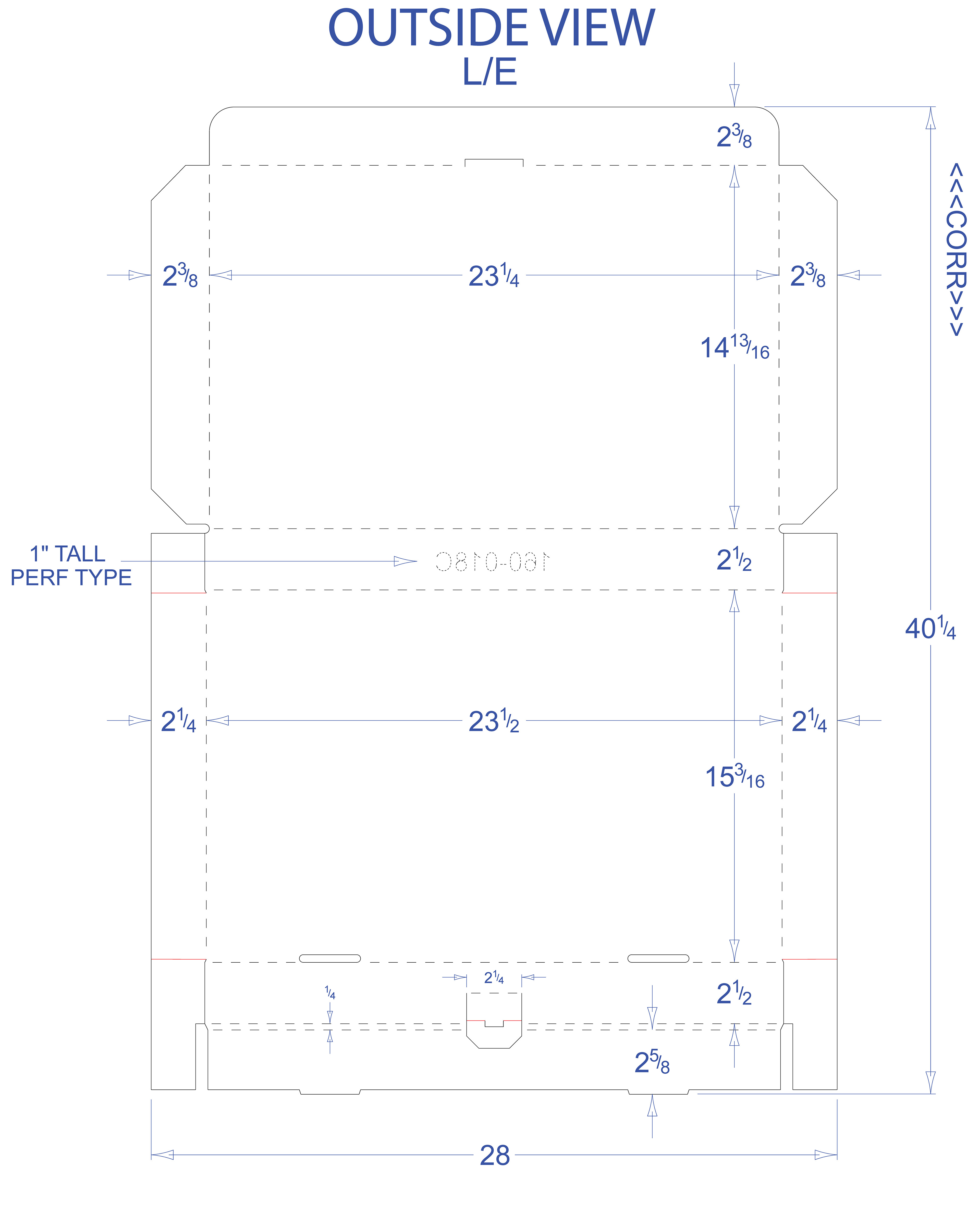
Early Package Redesign Mockups

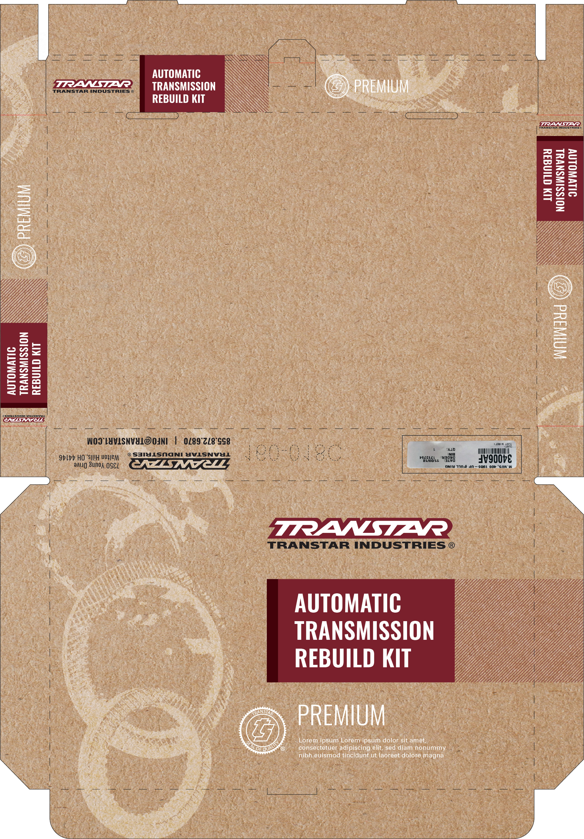

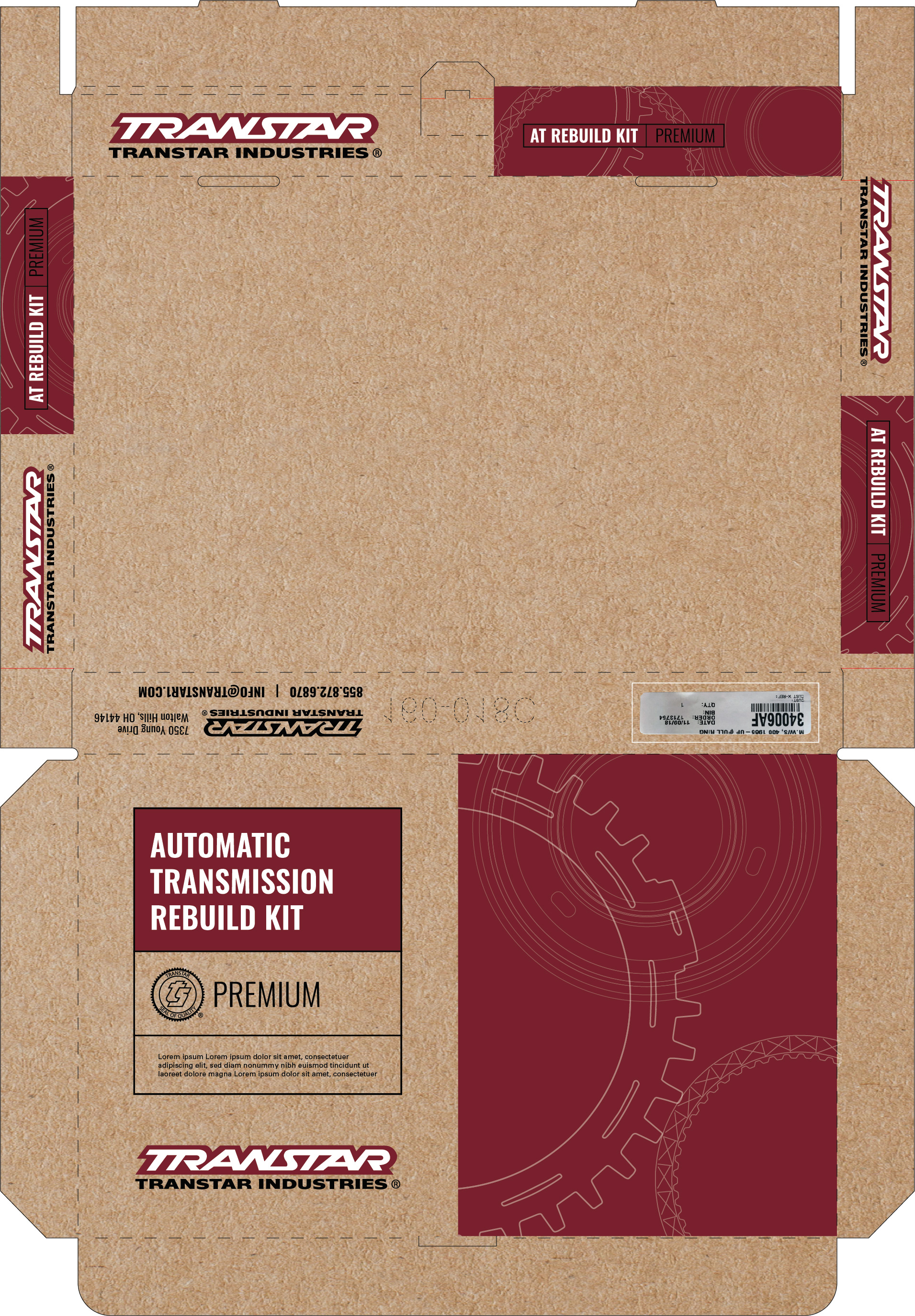
Final Production Ready Package Design
SWAG Shop Posters
Next Steps & Insights
Through this project I learned how powerful constraint can be—it forces creativity in layout, texture, and typography when color options and budgets are limited. Scanning real components taught me authenticity in pattern design helps build trust with a technical audience. Going forward I’d expand the brand into motion and digital mockups so that sub-brand cohesion persists online and in video. I’d also document vendor specs and file structure early to smooth production handoffs.